[1] "2024-03-15"# lubridate shortcuts
ymd("2024-03-15")[1] "2024-03-15"dmy("15/03/2024")[1] "2024-03-15"mdy("03-15-2024")[1] "2024-03-15"[1] "2024-03-01"Macroeconomic data is time series data, and it comes with its own set of practical challenges: mixed frequencies, seasonal patterns, real versus nominal values, data revisions, and rebasing. Before you can estimate a Phillips curve or build a VAR model, you need to get these fundamentals right.
This chapter covers the essential data wrangling operations you will use in every subsequent chapter. The techniques here are not glamorous, but they are where most of the errors in applied macro work originate. Getting dates, frequencies, and transformations right is the foundation of credible analysis.
R’s built-in as.Date() function handles most date parsing, but macroeconomic data often arrives in awkward formats — “2024 Q1”, “Jan-24”, or just “2024”. The lubridate package provides a more forgiving and readable set of date-parsing functions.
[1] "2024-03-15"# lubridate shortcuts
ymd("2024-03-15")[1] "2024-03-15"dmy("15/03/2024")[1] "2024-03-15"mdy("03-15-2024")[1] "2024-03-15"[1] "2024-03-01"When working with quarterly data, you need to convert quarter labels to dates. A useful convention is to assign each quarter to the first day of its first month: Q1 maps to 1 January, Q2 to 1 April, and so on.
library(dplyr)

# Convert "2024 Q1" style labels to dates
quarterly_data <- tibble(
  quarter = c("2024 Q1", "2024 Q2", "2024 Q3", "2024 Q4"),
  value = c(100, 101, 102, 103)
) |>
  mutate(
    year = as.integer(substr(quarter, 1, 4)),
    q = as.integer(substr(quarter, 7, 7)),
    date = as.Date(paste(year, (q - 1) * 3 + 1, "1", sep = "-"))
  )

quarterly_data
# A tibble: 4 × 5
quarter value year q date
<chr> <dbl> <int> <int> <date>
1 2024 Q1 100 2024 1 2024-01-01
2 2024 Q2 101 2024 2 2024-04-01
3 2024 Q3 102 2024 3 2024-07-01
4 2024 Q4 103 2024 4 2024-10-01One of the most common pain points in applied macro is merging data at different frequencies. GDP is quarterly; CPI, unemployment, and interest rates are monthly. You have two options: convert monthly data to quarterly, or (less commonly) interpolate quarterly data to monthly.
The standard approach is to aggregate monthly data to quarterly frequency. For stock variables (like a price index level), take the quarter average. For flow variables (like monthly retail sales), take the quarter sum.
library(ons)
library(dplyr)

# Monthly CPI
cpi <- ons_cpi()

# Convert monthly CPI to quarterly by averaging
cpi_quarterly <- cpi |>
  mutate(
    quarter_date = floor_date(date, "quarter")
  ) |>
  group_by(quarter_date) |>
  summarise(
    cpi = mean(value, na.rm = TRUE),
    .groups = "drop"
  ) |>
  rename(date = quarter_date)

# Quarterly GDP
gdp <- ons_gdp(measure = "level")

# Now both are quarterly — merge on date
combined <- inner_join(gdp, cpi_quarterly, by = "date")
head(combined)
date value cpi
1 1989-01-01 374612 4.966667
2 1989-04-01 376951 5.266667
3 1989-07-01 377573 5.133333
4 1989-10-01 377508 5.500000
5 1990-01-01 379458 5.866667
6 1990-04-01 381997 6.700000The floor_date() function from lubridate rounds each monthly date down to the first day of its quarter, creating a common key for grouping. Using inner_join() keeps only quarters where both series have data, which avoids introducing NA values at the edges.
Be careful with the timing. Some quarterly series are dated to the first day of the quarter (1 January for Q1), others to the last day (31 March for Q1). Check your data before merging, and standardise to one convention.
# Check: are both series using the same date convention?
head(gdp$date)
[1] "1955-01-01" "1955-04-01" "1955-07-01" "1955-10-01" "1956-01-01"
[6] "1956-04-01"head(cpi_quarterly$date)[1] "1989-01-01" "1989-04-01" "1989-07-01" "1989-10-01" "1990-01-01"
[6] "1990-04-01"# If GDP uses end-of-quarter dates, convert:
# gdp <- gdp |> mutate(date = floor_date(date, "quarter"))Most macroeconomic time series exhibit strong seasonal patterns. Retail sales spike in December. Construction output drops in winter. Unemployment rises after the summer hiring season ends. These patterns are predictable and repeat every year, which means they are usually not informative about the underlying trend in the economy.
Seasonal adjustment removes these predictable calendar effects, revealing the underlying signal. The gold standard method is X-13ARIMA-SEATS, developed by the US Census Bureau and used by most national statistical offices including the ONS. In R, the seasonal package provides a clean interface to the X-13 program.
The seasonal package expects a ts object (R’s classic time series class), not a data frame. You need to convert your data before passing it to the seas() function.
# Convert to ts object
# Assuming monthly data starting from the first observation
start_year <- as.numeric(format(min(cpi$date), "%Y"))
start_month <- as.numeric(format(min(cpi$date), "%m"))

cpi_ts <- ts(cpi$value, start = c(start_year, start_month), frequency = 12)

# Run X-13ARIMA-SEATS seasonal adjustment
sa <- seas(cpi_ts)

# Extract the seasonally adjusted series
cpi_sa <- final(sa)
Plotting the raw and seasonally adjusted series side by side reveals the seasonal pattern that has been removed.
library(ggplot2)

# Combine raw and adjusted for plotting
sa_comparison <- tibble(
  date = cpi$date,
  raw = as.numeric(cpi_ts),
  adjusted = as.numeric(cpi_sa)
) |>
  tidyr::pivot_longer(cols = c(raw, adjusted), names_to = "series", values_to = "value")

ggplot(sa_comparison, aes(x = date, y = value, colour = series)) +
  geom_line() +
  scale_colour_macro() +
  labs(
    title = "CPI index: raw vs seasonally adjusted",
    x = NULL, y = "Index",
    colour = NULL
  ) +
  theme_macro()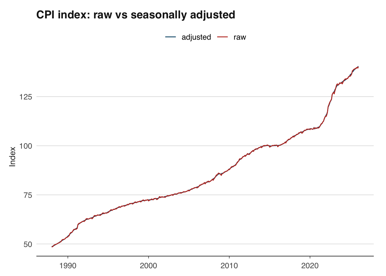
Most official data sources publish both raw and seasonally adjusted series. When the adjusted version is available, use it directly rather than adjusting the raw data yourself — the statistical office will have applied more sophisticated calendar and trading-day corrections than a simple seas() call can achieve. Do your own seasonal adjustment only when working with series that are not published in adjusted form, such as certain tax receipt series from HMRC.
Nominal values are measured in current prices — the prices that prevailed at the time. Real values strip out the effect of inflation, allowing you to compare purchasing power across time. This distinction is fundamental: nominal UK GDP roughly doubled between 2000 and 2024, but much of that increase reflects higher prices rather than more goods and services being produced.
The inflateR package makes it straightforward to deflate nominal series to real terms using a price index.
Average weekly earnings (AWE) from the ONS are reported in nominal terms. To understand whether workers are genuinely better off, we need to adjust for the rising cost of living.
The deflation formula is:
\[ \text{Real value}_t = \frac{\text{Nominal value}_t}{\text{Price index}_t} \times 100 \]
where the price index is set to 100 in the base period. This expresses the real value in base-period prices.
# Pull nominal wages (level, in GBP) and CPI index
wages <- ons_wages(measure = "level")
cpi <- ons_cpi(type = "index")

head(wages)
date value
1 2000-01-01 305
2 2000-02-01 300
3 2000-03-01 311
4 2000-04-01 309
5 2000-05-01 311
6 2000-06-01 311head(cpi) date value
1 1988-01-01 48.4
2 1988-02-01 48.6
3 1988-03-01 48.7
4 1988-04-01 49.3
5 1988-05-01 49.5
6 1988-06-01 49.7# Use inflateR to adjust a single value for inflation
# For example: what is GBP 300 from 2000 worth in today's prices?
adjust_inflation(amount = 300, from_year = 2000, currency = "GBP")[1] 542.79# For deflating an entire time series, manual deflation
# using a price index (shown below) gives you full control.The adjust_inflation() function is useful for quick comparisons of single values across time. For deflating an entire time series, you can merge with a price index and divide, as shown next.
# Manual deflation for full control
# Merge wages and CPI on date
wages_real <- inner_join(
  wages |> select(date, nominal = value),
  cpi |> select(date, cpi = value),
  by = "date"
) |>
  mutate(
    # Rebase CPI to Jan 2019 = 100
    cpi_rebased = cpi / cpi[date == as.Date("2019-01-01")] * 100,
    # Deflate
    real = nominal / cpi_rebased * 100
  )

ggplot(wages_real, aes(x = date)) +
  geom_line(aes(y = nominal, colour = "Nominal")) +
  geom_line(aes(y = real, colour = "Real (2019 prices)")) +
  scale_colour_macro() +
  labs(
    title = "Average weekly earnings: nominal vs real",
    x = NULL, y = "GBP per week",
    colour = NULL
  ) +
  theme_macro()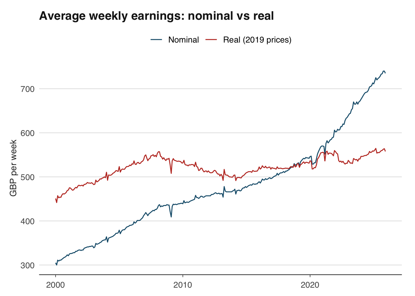
The gap between the nominal and real series shows the cumulative effect of inflation. During periods of high inflation (such as 2022–2023), the gap widens rapidly — nominal wages may be rising, but real wages are falling.
Many macroeconomic series are published as index numbers rather than levels. The ONS publishes CPI with 2015 = 100; the ECB publishes HICP with 2015 = 100. When comparing indices or presenting them to an audience, you often want to rebase to a different reference period — for example, setting the index to 100 at the start of the Covid-19 pandemic to show recovery paths.
The rebasing formula is simple:
\[ \text{Rebased index}_t = \frac{\text{Original index}_t}{\text{Original index}_{\text{base}}} \times 100 \]
In R:
        date value  rebased
1 1988-01-01  48.4 44.73198
2 1988-02-01  48.6 44.91682
3 1988-03-01  48.7 45.00924
4 1988-04-01  49.3 45.56377
5 1988-05-01  49.5 45.74861
6 1988-06-01  49.7 45.93346
This works for any index. You can rebase to any date that exists in your series. A common application is comparing the recovery of different countries’ GDP from a common shock, with all indices set to 100 at the pre-shock peak.
library(readoecd)
library(dplyr)
library(ggplot2)

# Compare GDP across major economies using OECD data
# OECD GDP is annual, so we rebase to 2019 = 100
gdp_oecd <- get_oecd_gdp(
  countries = c("DEU", "FRA", "ITA"),
  start_year = 2015
)

gdp_compared <- gdp_oecd |>
  group_by(country_name) |>
  mutate(rebased = value / value[year == 2019] * 100) |>
  ungroup()

ggplot(gdp_compared, aes(x = year, y = rebased, colour = country_name)) +
  geom_line() +
  geom_hline(yintercept = 100, linetype = "dashed") +
  scale_colour_macro() +
  labs(
    title = "GDP recovery from Covid-19",
    subtitle = "Index, 2019 = 100",
    x = NULL, y = "Index",
    colour = NULL
  ) +
  theme_macro()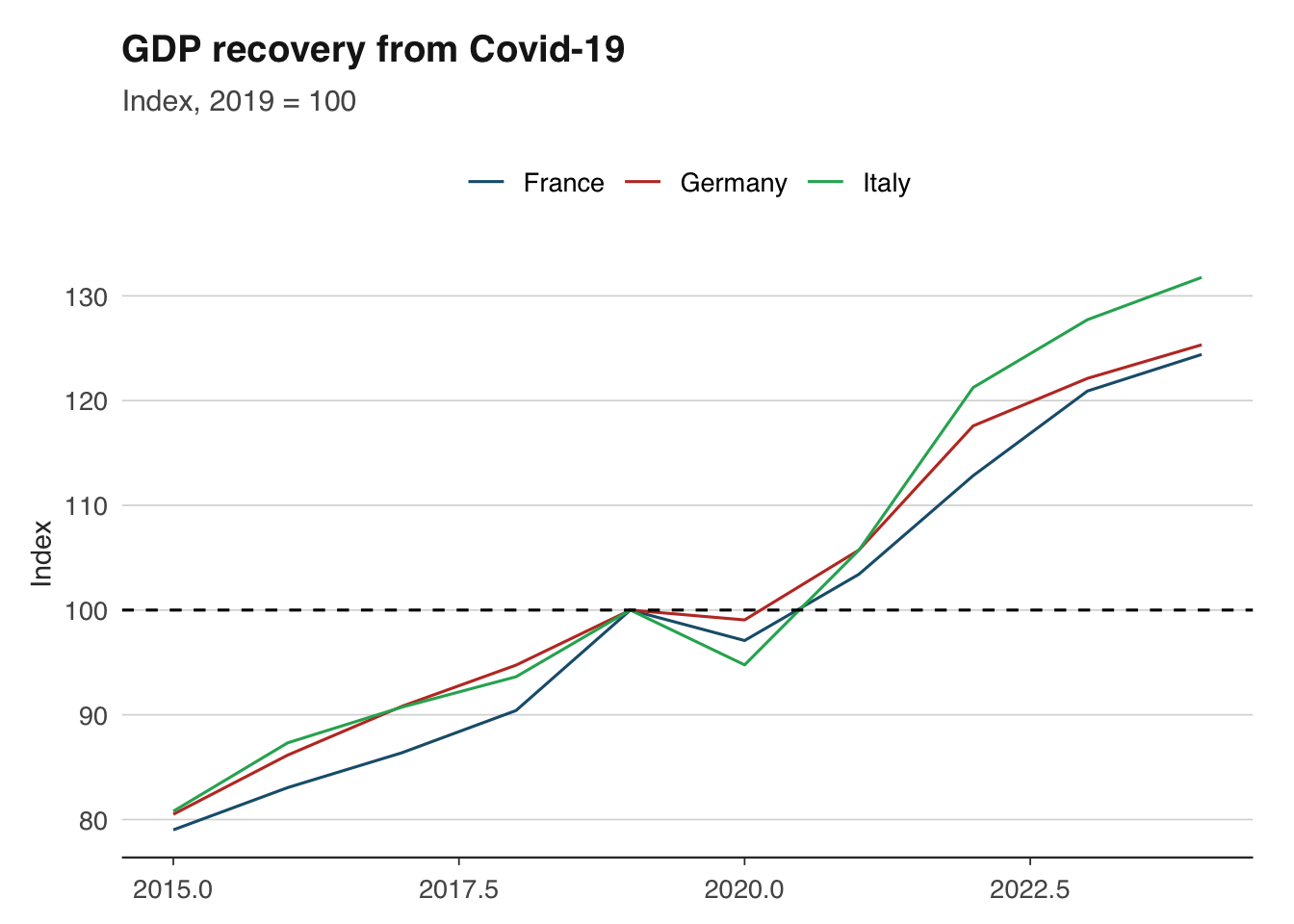
Growth rates are the language of macroeconomics. GDP growth, inflation, wage growth — all are growth rates of some underlying level. There are several conventions, and using the wrong one is a common source of confusion.
The most widely reported growth rate compares the current value to the same period one year ago. This automatically removes seasonal effects (since you are comparing like with like) and is the standard way of quoting inflation.
For quarterly data:
\[ g_{yoy,t} = \frac{x_t - x_{t-4}}{x_{t-4}} \times 100 \]
For monthly data:
\[ g_{yoy,t} = \frac{x_t - x_{t-12}}{x_{t-12}} \times 100 \]
        date  value      yoy
1 1955-01-01 145457       NA
2 1955-04-01 145551       NA
3 1955-07-01 147995       NA
4 1955-10-01 147119       NA
5 1956-01-01 148955 2.404834
6 1956-04-01 148835 2.256254
7 1956-07-01 148665 0.452718
8 1956-10-01 149607 1.691148Quarter-on-quarter (or month-on-month) growth measures the change from one period to the next. It is more timely than year-on-year growth — it tells you what happened this quarter — but it is noisier and affected by seasonal patterns unless the data is seasonally adjusted.
\[ g_{qoq,t} = \frac{x_t - x_{t-1}}{x_{t-1}} \times 100 \]
gdp_growth <- gdp_growth |>
  mutate(
    qoq = (value / lag(value, 1) - 1) * 100
)When reporting quarter-on-quarter growth, it is common (especially in the US) to annualise it — that is, to show what the annual growth rate would be if the quarter’s pace continued for a full year. This makes quarterly and annual figures more directly comparable.
\[ g_{annualised,t} = \left( \left( \frac{x_t}{x_{t-1}} \right)^4 - 1 \right) \times 100 \]
The exponent is 4 for quarterly data and 12 for monthly data.
gdp_growth <- gdp_growth |>
  mutate(
    qoq_annualised = ((value / lag(value, 1))^4 - 1) * 100
  )
Be cautious with annualised rates: they amplify noise. A single strong quarter can produce an eye-catching annualised growth rate that does not persist. The UK and euro area typically report non-annualised quarter-on-quarter rates, while the US reports annualised rates. This difference catches out many commentators — a reported US growth rate of 4 per cent corresponds to roughly 1 per cent quarter-on-quarter.
For small growth rates, the log difference is a good approximation that has useful mathematical properties (log differences are additive over time and symmetric for gains and losses). Many academic papers use log differences throughout.
\[ g_t \approx (\ln x_t - \ln x_{t-1}) \times 100 \]
The approximation is excellent for growth rates below 10 per cent and degrades for larger changes. For the extreme GDP swings during Covid-19 (drops of 20 per cent or more in a single quarter), log differences and percentage changes diverge substantially.
The distinction between trend and cycle is central to macroeconomics. Is GDP above or below its long-run sustainable level? The answer — the output gap — determines whether inflationary pressures are building and whether monetary policy should tighten or loosen.
The Hodrick-Prescott (HP) filter is the most widely used method for decomposing a time series into trend and cycle components. It works by finding the trend \(\tau_t\) that minimises:
\[ \min_{\tau_t} \left\{ \sum_{t=1}^{T} (y_t - \tau_t)^2 + \lambda \sum_{t=2}^{T-1} [(\tau_{t+1} - \tau_t) - (\tau_t - \tau_{t-1})]^2 \right\} \]
The first term penalises deviations of the actual series from the trend; the second penalises changes in the trend’s growth rate (i.e., curvature). The smoothing parameter \(\lambda\) controls the trade-off. The standard convention is \(\lambda = 1600\) for quarterly data and \(\lambda = 14400\) for monthly data.
The hpfilter() function returns the trend component and the cyclical component. The cyclical component is the output gap — positive values indicate the economy is running above trend, negative values below.
library(ggplot2)
library(dplyr)

hp_df <- tibble(
  date = gdp$date,
  actual = as.numeric(gdp_ts),
  trend = as.numeric(hp$trend),
  cycle = as.numeric(hp$cycle)
)

# Plot actual vs trend
ggplot(hp_df, aes(x = date)) +
  geom_line(aes(y = actual, colour = "Actual")) +
  geom_line(aes(y = trend, colour = "Trend"), linetype = "dashed") +
  scale_colour_macro() +
  labs(
    title = "UK GDP: actual vs HP trend",
    x = NULL, y = "GDP (index)",
    colour = NULL
  ) +
  theme_macro()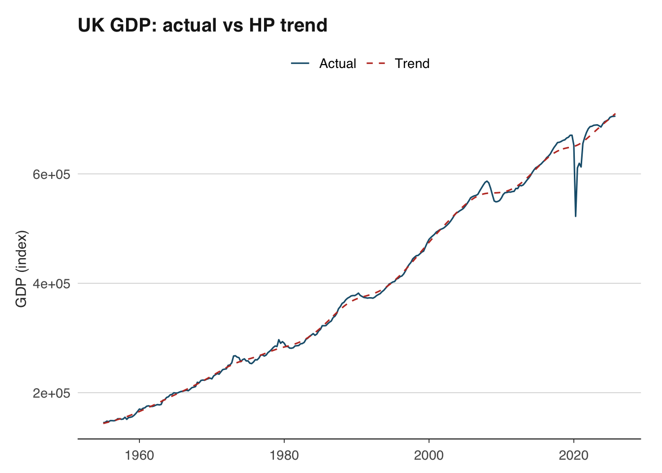
# Plot the output gap
ggplot(hp_df, aes(x = date, y = cycle)) +
  geom_line() +
  geom_hline(yintercept = 0, linetype = "dashed") +
  geom_ribbon(aes(ymin = pmin(cycle, 0), ymax = 0), fill = "red", alpha = 0.2) +
  geom_ribbon(aes(ymin = 0, ymax = pmax(cycle, 0)), fill = "blue", alpha = 0.2) +
  labs(
    title = "UK output gap (HP filter)",
    x = NULL, y = "Per cent of trend"
  ) +
  theme_macro()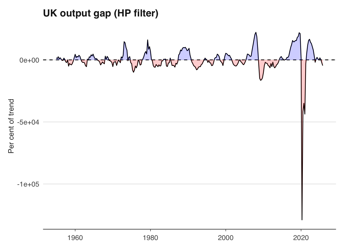
A word of caution: the HP filter has well-known limitations. It suffers from severe end-point bias — the trend estimate at the end of the sample is heavily influenced by the last few observations and is frequently revised as new data arrives. This means the output gap estimate that matters most for policy (the current one) is also the least reliable. The filter can also produce spurious cycles in data that has no true cyclical component. Despite these issues, it remains ubiquitous in policy institutions and academic work because it is simple, transparent, and provides a useful benchmark.
Macroeconomic data is revised, sometimes substantially. The first estimate of UK quarterly GDP is published approximately 40 days after the quarter ends, based on incomplete survey data. It is then revised as more comprehensive data becomes available — typically in a second estimate (about 60 days after), a quarterly national accounts release (about 90 days), and then annual and benchmark revisions that can occur years later.
These revisions matter for two reasons. First, they mean that the data you download today for 2023 Q1 is not the same data that policymakers were looking at when they made decisions in 2023 Q1. Evaluating a forecast or a policy decision using the latest revised data is unfair — you need real-time data (the data as it was first published). Second, revisions can change the economic narrative: preliminary estimates sometimes suggest recession when revised data shows continued growth, or vice versa.
GDP revisions in the UK are not trivial. The average absolute revision to the first estimate of quarterly GDP growth is around 0.1–0.2 percentage points, but individual revisions can be much larger. The ONS’s revisions analysis shows that early estimates of GDP around turning points — precisely when accuracy matters most — tend to be revised more than estimates during stable periods.
library(ons)
library(dplyr)

# The latest vintage of GDP data
gdp <- ons_gdp(measure = "level")

# Unfortunately, most data APIs only serve the latest vintage.
# For real-time analysis, you need a real-time database.
# The OECD publishes a real-time database for key indicators:
# https://stats.oecd.org/Index.aspx?DataSetCode=MEI_REAL
# The Bank of England also maintains a real-time GDP dataset.When building forecasting models, be aware that backtesting with revised data flatters your model’s performance. The data your model would have had access to in real time was noisier and potentially biased relative to the final revised figures. This problem is known as the “look-ahead bias” and is one of the most common pitfalls in applied macro forecasting.
For analysis that does not involve forecasting — such as describing historical episodes or estimating structural relationships — using the latest revised data is usually appropriate, since it is the most accurate picture of what actually happened.
A pragmatic approach for most applied work:
Download monthly UK CPI data and quarterly GDP data. Convert CPI to quarterly frequency by averaging within each quarter. Merge the two series on their date column and verify that the resulting data frame has no missing values.
Using inflateR, convert a series of nominal UK average weekly earnings to real terms using January 2019 as the base period. Plot nominal and real wages on the same chart. In which year did the gap between them widen most sharply?
Rebase the ECB’s HICP index for Germany and France to January 2015 = 100. Then rebase both to January 2020 = 100. Plot the rebased series. Which country has seen faster cumulative inflation since January 2020?
Calculate quarter-on-quarter, year-on-year, and annualised quarter-on-quarter GDP growth rates for the UK. Plot all three on the same chart using facets. Which measure is most volatile?
Apply the HP filter to UK quarterly GDP with \(\lambda = 1600\). Plot the estimated output gap. When was the output gap most negative since 2000? Does this align with known recessions?
The log approximation \(g_t \approx \ln(x_t) - \ln(x_{t-1})\) breaks down for large changes. Using UK GDP data from 2020, calculate both the exact percentage change and the log approximation for each quarter. How large is the discrepancy in Q2 2020?