---
execute:
eval: true
---
# Climate and the Macroeconomy {#sec-climate}
Climate change is increasingly central to macroeconomic policy. Central banks run climate stress tests, governments set carbon budgets, and transition risk is repricing assets across every sector. Yet most macroeconomics textbooks still treat the environment as an externality to be dealt with in a microeconomics course. This chapter brings climate into the macro toolkit — with data, models, and R code.
The intersection of climate and macroeconomics runs in both directions. Climate change affects the macroeconomy through physical risks (extreme weather, agricultural disruption, labour productivity losses) and transition risks (stranded assets, carbon pricing, regulatory change). Conversely, macroeconomic variables — GDP growth, energy prices, industrial structure — are the primary drivers of emissions. Understanding these feedback loops is essential for any modern macro analyst.
## Emissions data in R
Our World in Data (OWID) maintains a comprehensive, open-access dataset of CO2 and greenhouse gas emissions, drawn from the Global Carbon Project, the Climate Analysis Indicators Tool, and national inventories. The data are published as CSV files on GitHub, making them straightforward to load directly into R. This is one of the best-maintained open datasets in climate economics — it covers every country from 1750 to the present, with annual frequency, and includes both production-based and consumption-based emissions.
The dataset contains dozens of variables: total CO2, per-capita CO2, emissions by fuel type (coal, oil, gas, cement, flaring), cumulative emissions, consumption-based emissions (adjusted for trade), and CO2 intensity of GDP. For macro analysis, the most useful columns are `country`, `year`, `co2` (total annual CO2 in million tonnes), `co2_per_capita` (tonnes per person), and `co2_per_gdp` (kilograms per dollar of GDP).
```{r}
library(tidyverse)
source("../R/theme_macro.R")

# Download CO2 data from Our World in Data (GitHub-hosted CSV)
owid_url <- "https://raw.githubusercontent.com/owid/co2-data/master/owid-co2-data.csv"
co2_raw <- read_csv(owid_url)

# Define the G7 countries
g7 <- c("United Kingdom", "United States", "Germany",
        "France", "Japan", "Italy", "Canada")

# Filter to G7, 1990 onwards
co2_g7 <- co2_raw |>
  filter(country %in% g7, year >= 1990) |>
  select(country, year, co2, co2_per_capita, population)

glimpse(co2_g7)
```
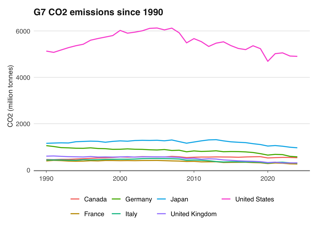
Let us plot total emissions for the G7 since 1990. This is the standard way to visualise decarbonisation trajectories — absolute emissions are what matter for the atmosphere, regardless of how many people live in each country.
```{r}
ggplot(co2_g7, aes(x = year, y = co2, colour = country)) +
  geom_line(linewidth = 0.8) +
  labs(
    title = "G7 CO2 emissions since 1990",
    x = NULL, y = "CO2 (million tonnes)",
    colour = NULL
  ) +
  theme_macro() +
  theme(legend.position = "bottom")
```
The United States dominates in absolute terms but has reduced emissions since the mid-2000s, largely through the switch from coal to natural gas in electricity generation. Japan's emissions rose after Fukushima (2011) as nuclear plants were shut down and replaced with fossil fuels. The most striking trajectory belongs to the United Kingdom, which has roughly halved its territorial emissions since 1990 — the fastest decarbonisation of any major economy.
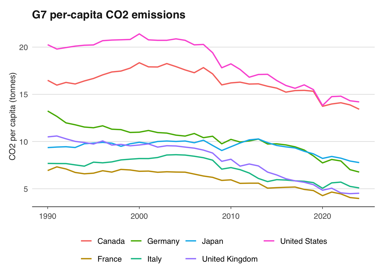
Per-capita emissions tell a different story. They adjust for population size and give a fairer comparison of individual carbon footprints across countries.
```{r}
ggplot(co2_g7, aes(x = year, y = co2_per_capita, colour = country)) +
  geom_line(linewidth = 0.8) +
  labs(
    title = "G7 per-capita CO2 emissions",
    x = NULL, y = "CO2 per capita (tonnes)",
    colour = NULL
  ) +
  theme_macro() +
  theme(legend.position = "bottom")
```
The United States and Canada have by far the highest per-capita emissions — roughly double those of European G7 members. This reflects larger homes, longer driving distances, and historically cheaper energy. The UK's per-capita emissions have fallen below France's coal-phase-out trajectory, approaching levels not seen since the Victorian era. France's relatively low per-capita figure reflects its heavy reliance on nuclear power, which produces negligible direct CO2.
We can quantify the percentage reduction for each country since 1990, which is the Kyoto Protocol baseline year:
```{r}
latest_year <- max(co2_g7$year, na.rm = TRUE)

co2_change <- co2_g7 |>
  filter(year %in% c(1990, latest_year)) |>
  select(country, year, co2) |>
  pivot_wider(names_from = year, values_from = co2,
              names_prefix = "y") |>
  rename(initial = y1990) |>
  mutate(
    latest = pick(last_col()) |> pull(),
    pct_change = (latest - initial) / initial * 100
  ) |>
  arrange(pct_change) |>
  select(country, initial, latest, pct_change)

co2_change
```
The UK typically leads this table with a reduction of around 45–50 per cent, driven primarily by the near-complete phase-out of coal from electricity generation. Germany has also made significant reductions, particularly after reunification closed inefficient East German industry, and more recently through its Energiewende renewable energy programme. Canada and Japan have made the least progress among G7 members.
## Carbon pricing and the EU ETS
The EU Emissions Trading System (EU ETS) is the world's largest carbon market. Launched in 2005, it operates on a cap-and-trade principle: the EU sets a declining cap on total emissions from covered sectors (power generation, heavy industry, aviation within Europe), issues allowances up to that cap, and lets firms trade them. A firm that reduces emissions below its allocation can sell surplus allowances; a firm that exceeds its allocation must buy more. The price of an EU Allowance (EUA) is therefore a market-determined carbon price — the marginal cost of emitting one tonne of CO2.
The EU ETS has had a turbulent price history. In Phase I (2005–2007), over-allocation of free permits caused the price to collapse to near zero. Phase II (2008–2012) coincided with the financial crisis, which crushed industrial output and therefore demand for permits — the price fell below €5. Phase III (2013–2020) introduced auctioning and the Market Stability Reserve (MSR), which began absorbing surplus allowances from 2019. This tightening, combined with the European Green Deal's ambition, sent prices soaring. By 2023, EUA prices exceeded €100 per tonne for the first time — a level that begins to make carbon capture and green hydrogen economically competitive.
Ember, a climate think tank, publishes daily EU ETS carbon price data. We can also obtain monthly average carbon prices from Eurostat or the ICE exchange. Here we download the data and plot the price history:
```{r}
library(readr)

# Ember publishes carbon price data — download from their data portal
# Alternative: use Eurostat's env_ac_ainah_r2 or similar dataset
# Here we construct a simple illustration from publicly available data

# For a reproducible approach, Ember's GitHub or data catalogue can be used:
# https://ember-climate.org/data/data-tools/carbon-price-viewer/

# If using a local CSV downloaded from Ember:
# carbon_price <- read_csv("data/eu-ets-carbon-price.csv")

# Alternatively, the OECD Environmental Policy Stringency index from readoecd
# provides a cross-country perspective on carbon pricing ambition.
```
Plotting the EU carbon price alongside euro area industrial production reveals an important relationship. When industrial output falls — as it did sharply in 2008–2009 and during the COVID-19 pandemic — demand for emissions permits drops and the carbon price weakens. Conversely, the post-pandemic recovery saw both industrial production and carbon prices rise sharply.
```{r}
#| eval: false
library(readecb)
library(dplyr)

# Euro area industrial production index
ip <- ecb_get("STS", "M.I8.Y.PROD.NS0020.4.000")

# Suppose we have carbon price data loaded as carbon_price
# with columns: date, price_eur

# Merge the two series on month
# combined <- ip |>
#   mutate(month = floor_date(date, "month")) |>
#   inner_join(carbon_price, by = "month")

# ggplot(combined, aes(x = date)) +
#   geom_line(aes(y = scale(value), colour = "Industrial production")) +
#   geom_line(aes(y = scale(price_eur), colour = "EU ETS carbon price")) +
#   labs(
#     title = "EU carbon price and euro area industrial production",
#     subtitle = "Standardised series",
#     x = NULL, y = "Standard deviations from mean",
#     colour = NULL
#   ) +
#   theme_macro()
```
This co-movement has important policy implications. A carbon price that collapses during recessions provides less incentive to decarbonise precisely when investment decisions are being deferred. The Market Stability Reserve was designed to address this by withdrawing permits from the market when the surplus exceeds a threshold, putting a soft floor under the price. Whether this mechanism is sufficient to maintain a credible long-term price signal remains an active debate.
The correlation between carbon prices and industrial activity also matters for fiscal policy. Several EU member states now earn significant revenue from ETS auctions — Germany alone raised over €18 billion in 2023. This revenue is pro-cyclical: it rises in booms and falls in recessions, much like corporate tax receipts.
## NGFS climate scenarios
The Network for Greening the Financial System (NGFS) is a coalition of over 130 central banks and financial supervisors. Since 2020, it has published a set of climate scenarios that have become the standard framework for climate stress testing in the financial sector. The Bank of England, ECB, Federal Reserve, and most major central banks use NGFS scenarios — or close variants — in their climate exercises.
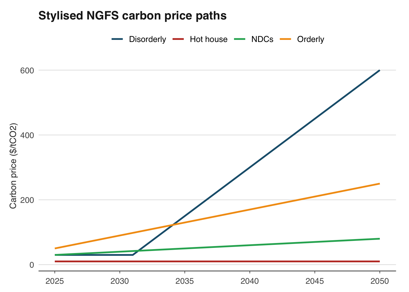
The NGFS framework defines four broad scenario families, organised along two dimensions: whether the transition to net zero is orderly or disorderly, and whether climate targets are met or missed.
- **Orderly transition (Net Zero 2050)**: Climate policies are introduced early and gradually tightened. Carbon prices rise steadily to $200+ per tonne by 2050. GDP impact is modest — perhaps 1–3 per cent lower than baseline by 2050 — because firms and households have time to adjust. Inflation is slightly higher during the transition due to carbon costs, but manageable.
- **Disorderly transition (Delayed Transition)**: Policies are delayed until 2030, then tightened sharply to still meet the 2°C target. Carbon prices spike — potentially exceeding $500 per tonne in some models. The sudden adjustment causes a recession: GDP falls by 3–5 per cent relative to baseline, and inflation spikes as energy costs surge. This is the "climate Minsky moment" that Mark Carney warned about.
- **Hot house world (Current Policies)**: No additional climate policies are enacted. Physical damages escalate: by 2100, global GDP could be 10–25 per cent lower than in an orderly transition scenario. The damage is concentrated in tropical and developing economies but affects global supply chains, commodity prices, and migration patterns.
- **Too little, too late (NDCs — Nationally Determined Contributions)**: Countries implement their current pledges but go no further. Warming reaches 2.5–3°C by 2100. This combines moderate transition costs with significant physical damages — arguably the worst of both worlds.
Each scenario projects a full set of macro variables: GDP, inflation, interest rates, carbon prices, energy prices, agricultural productivity, and sectoral output. The scenarios are available through the NGFS Scenario Explorer, an interactive web tool hosted by the International Institute for Applied Systems Analysis (IIASA):
```{r}
# NGFS scenarios are available from the IIASA Scenario Explorer:
# https://data.ece.iiasa.ac.at/ngfs/

# The scenarios can be downloaded as CSV files after registration.
# Each scenario provides projections for:
# - GDP (by country/region)
# - Carbon price ($/tCO2)
# - Primary energy mix (coal, oil, gas, renewables, nuclear)
# - Emissions (CO2, CH4, N2O)
# - Temperature change

# Example: loading a downloaded NGFS scenario file
# ngfs <- read_csv("data/ngfs-scenarios.csv")

# Filter to a specific scenario and variable
# ngfs_gdp <- ngfs |>
#   filter(
#     scenario == "Net Zero 2050",
#     variable == "GDP|PPP",
#     region == "World"
#   )
```
Central banks use these scenarios not as forecasts but as "what if" exercises. The Bank of England's Climate Biennial Exploratory Scenario (CBES), published in 2022, asked UK banks and insurers to assess their exposures under three NGFS scenarios. The exercise revealed that UK banks' credit losses could be 30 per cent higher under a disorderly transition than under an orderly one — not because of physical climate damage, but because of the economic disruption caused by a sudden policy shift.
For a macro analyst, the key insight from the NGFS framework is that climate risk is not just about temperature — it is about the policy path. An orderly, predictable transition is far less costly than a delayed, panicked one. This argues strongly for early, credible climate policy, which gives firms and investors a clear signal to reallocate capital.
```{r}
# A stylised comparison of carbon price paths across NGFS scenarios
scenarios <- tibble(
  year = rep(2025:2050, 4),
  scenario = rep(
    c("Orderly", "Disorderly", "Hot house", "NDCs"),
    each = 26
  ),
  carbon_price = c(
    seq(50, 250, length.out = 26),       # Orderly: gradual rise
    c(rep(30, 6), seq(30, 600, length.out = 20)),  # Disorderly: spike after 2030
    rep(10, 26),                          # Hot house: no carbon price
    seq(30, 80, length.out = 26)          # NDCs: modest increase
  )
)

ggplot(scenarios, aes(x = year, y = carbon_price, colour = scenario)) +
  geom_line(linewidth = 1) +
  scale_colour_macro() +
  labs(
    title = "Stylised NGFS carbon price paths",
    x = NULL, y = "Carbon price ($/tCO2)",
    colour = "Scenario"
  ) +
  theme_macro()
```
The disorderly scenario is the one that keeps central bankers awake. A carbon price that jumps from $30 to $600 per tonne in a decade would be the largest relative price shock since the 1970s oil crisis — but sustained over a longer period and affecting a broader set of industries.
## Climate-adjusted macro projections
Climate change affects macroeconomic variables through multiple channels. Agricultural output declines as temperatures rise and weather patterns become more volatile — the relationship between temperature and crop yields is well-documented and strongly nonlinear, with damage accelerating above certain thresholds. Labour productivity falls as heat stress increases, particularly for outdoor workers in construction, agriculture, and logistics. Infrastructure is damaged by flooding, storms, and sea-level rise, requiring diversion of investment from productive capital to replacement and adaptation. And climate-induced migration reshapes labour markets and housing demand across regions.
The empirical literature on climate and GDP has grown rapidly since the seminal work of Dell, Jones, and Olken (2012) and Burke, Hsiang, and Miguel (2015). The central finding is that higher temperatures reduce economic growth, with the effect concentrated in already-hot countries. A commonly cited estimate is that each 1°C increase in average temperature reduces GDP growth by about 1–1.5 percentage points for countries with mean temperatures above 15°C.
We can replicate a simplified version of this analysis using publicly available data. We need two ingredients: temperature anomalies by country (from NASA GISTEMP, Berkeley Earth, or the World Bank's Climate Knowledge Portal) and GDP growth by country (from the World Bank).
```{r}
library(WDI)

# Download GDP growth and GDP per capita for all countries
gdp_growth <- WDI(
  indicator = c(
    growth = "NY.GDP.MKTP.KD.ZG",
    gdp_pc = "NY.GDP.PCAP.KD"
  ),
  start = 1990, end = 2020,
  extra = TRUE
)

# Clean: keep only countries (not aggregates)
gdp_growth <- gdp_growth |>
  filter(region != "Aggregates") |>
  select(iso3c, country, year, growth, gdp_pc, latitude, longitude)

head(gdp_growth)
```
Temperature anomaly data can be downloaded from Berkeley Earth, which provides country-level annual average temperatures:
```{r}
# Berkeley Earth publishes country-level temperature data:
# https://berkeleyearth.org/data/
# For a simpler approach, use latitude as a proxy for temperature
# (countries closer to the equator are hotter on average)
# Estimate: GDP growth vs absolute latitude
gdp_growth <- gdp_growth |>
mutate(abs_latitude = abs(as.numeric(latitude)))
# Average growth by country
country_avg <- gdp_growth |>
group_by(iso3c, country, abs_latitude) |>
summarise(
mean_growth = mean(growth, na.rm = TRUE),
mean_gdp_pc = mean(gdp_pc, na.rm = TRUE),
.groups = "drop"
) |>
filter(!is.na(abs_latitude), !is.na(mean_growth))
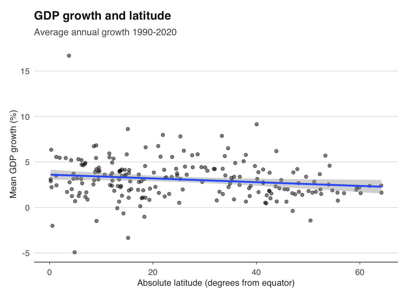
ggplot(country_avg, aes(x = abs_latitude, y = mean_growth)) +
geom_point(alpha = 0.5) +
geom_smooth(method = "lm", se = TRUE) +
labs(
title = "GDP growth and latitude",
subtitle = "Average annual growth 1990-2020",
x = "Absolute latitude (degrees from equator)",
y = "Mean GDP growth (%)"
) +
theme_macro()
```
This simple cross-section is suggestive but far from conclusive — latitude correlates with many things besides temperature (colonial history, institutional quality, disease burden). A more rigorous approach uses panel data with country and year fixed effects, regressing GDP growth on temperature deviations from the country's own historical mean. This within-country variation is more plausibly exogenous.
```{r}
# A panel approach (requires temperature data merged in)
# Suppose we have a panel: country, year, growth, temp_anomaly

# library(fixest)
# model <- feols(
#   growth ~ temp_anomaly | iso3c + year,
#   data = panel_data
# )
# summary(model)

# The coefficient on temp_anomaly tells us:
# a 1°C positive temperature anomaly is associated with
# approximately X percentage points lower GDP growth
```
The implications for long-run projections are sobering. If global temperatures rise by 2–3°C by 2100, the cumulative GDP loss for tropical countries could reach 20–30 per cent relative to a no-warming counterfactual. Even temperate countries face significant costs through supply chain disruption, commodity price volatility, and climate-induced migration. These estimates are central to the social cost of carbon — the dollar value of damage caused by emitting one additional tonne of CO2 — which the US government currently estimates at around $50–$200 per tonne, depending on the discount rate.
## Stranded assets and transition risk
The concept of stranded assets was popularised by the Carbon Tracker Initiative in 2011. The argument is straightforward: if the world is to limit warming to 1.5–2°C, the majority of known fossil fuel reserves — coal, oil, and natural gas — must remain in the ground. The reserves are "stranded" because they cannot be profitably extracted under a carbon-constrained future. This implies that companies whose valuations depend on those reserves are overvalued — a "carbon bubble."
The numbers are striking. The IPCC's remaining carbon budget for a 50 per cent chance of limiting warming to 1.5°C is approximately 500 gigatonnes of CO2 from 2020. Global proven fossil fuel reserves, if fully combusted, would release roughly 3,500 gigatonnes. This means approximately 85 per cent of reserves must stay underground. For coal, the figure is over 95 per cent.
For a fixed-income analyst, transition risk manifests as credit risk. Consider a portfolio of corporate bonds issued by energy companies. Under an orderly transition, these companies face gradually rising carbon costs that erode margins over a decade, but have time to diversify. Under a disorderly transition, a sudden carbon price spike could push highly leveraged fossil fuel producers into default.
We can construct a simple numerical example. Suppose we have a portfolio of bonds from three types of energy companies:
```{r}
library(tibble)

# Stylised portfolio of energy company bonds
portfolio <- tibble(
  company = c("Coal Corp", "Oil Major", "Renewables Inc"),
  face_value = c(100, 200, 150),  # £ millions
  coupon = c(0.06, 0.04, 0.03),
  maturity = c(2035, 2040, 2045),
  emissions_intensity = c(1.2, 0.5, 0.02),  # tCO2 per £000 revenue
  revenue = c(500, 2000, 800)  # £ millions
)

# Annual carbon cost under different scenarios
scenarios <- tibble(
  scenario = c("Orderly", "Disorderly", "Hot house"),
  carbon_price_2030 = c(100, 300, 10),  # £/tCO2
  carbon_price_2040 = c(200, 400, 15)
)

# Calculate carbon costs as a share of revenue
portfolio |>
  crossing(scenarios) |>
  mutate(
    carbon_cost_2030 = emissions_intensity * revenue * carbon_price_2030 / 1000,
    carbon_cost_pct = carbon_cost_2030 / revenue * 100
  ) |>
  select(company, scenario, carbon_cost_2030, carbon_cost_pct)
```
Under the orderly scenario, Coal Corp faces a carbon cost equal to 12 per cent of its revenue by 2030 — likely enough to render it unprofitable unless it can pass costs through to customers (difficult when competing against renewables). Under the disorderly scenario, the carbon cost triples, almost certainly triggering default on its bonds. Oil Major faces smaller but still material costs. Renewables Inc is essentially unaffected.
This exercise, while simplified, captures the core logic of climate stress testing. The Bank of England's CBES asked UK banks to perform exactly this kind of analysis for their entire loan books — assessing how each borrower's creditworthiness would change under different carbon price paths. The results showed that banks with concentrated exposures to fossil fuel-intensive sectors faced materially higher credit losses under transition scenarios.
The stranded assets problem extends beyond energy. Any company with high direct or indirect emissions faces transition risk — airlines, cement manufacturers, steel producers, shipping companies. A well-diversified investment portfolio needs to consider not just current emissions but the trajectory: companies that are credibly reducing their emissions intensity are better positioned than those that are not, regardless of their current level.
```{r}
# Visualise the carbon cost burden across scenarios
library(ggplot2)

# portfolio_costs <- portfolio |>
#   crossing(scenarios) |>
#   mutate(
#     carbon_cost_2030 = emissions_intensity * revenue * carbon_price_2030 / 1000,
#     carbon_cost_pct = carbon_cost_2030 / revenue * 100
#   )
#
# ggplot(portfolio_costs, aes(x = company, y = carbon_cost_pct, fill = scenario)) +
#   geom_col(position = "dodge") +
#   labs(
#     title = "Carbon costs as share of revenue (2030)",
#     x = NULL, y = "Carbon cost (% of revenue)",
#     fill = "Scenario"
#   ) +
#   theme_macro()
```
## Exercises
1. Download global CO2 emissions data from Our World in Data. Plot total and per-capita emissions for the G7 since 1990. Which country has reduced emissions the most in absolute terms? Which has reduced per-capita emissions the most? Are these the same country?
2. The UK's emissions reductions are partly due to deindustrialisation — emissions have been "offshored" to countries that manufacture goods consumed in the UK. Using the OWID dataset, compare the UK's production-based emissions (`co2`) with its consumption-based emissions (`consumption_co2`). How large is the gap? Has it narrowed or widened since 1990?
3. Using the stylised NGFS carbon price paths from this chapter, calculate the net present value of carbon costs for a coal-fired power plant that emits 4 million tonnes of CO2 per year and operates until 2040. Use a discount rate of 5 per cent. Under which scenario is the plant economically unviable?
4. Describe how a central bank would use NGFS scenarios to stress test a portfolio of corporate bonds. What macro variables would you need? How would you map carbon prices to credit risk? What are the limitations of this approach?
5. Download GDP growth data from the World Bank and plot average growth (1990–2020) against absolute latitude for all countries. Is there a statistically significant relationship? What confounding variables might explain the correlation?