---
execute:
eval: true
---
# Publication-Quality Economic Charts {#sec-charts}
A good chart can carry an argument. Central bank reports, budget documents, and think tank publications all rely on a small set of chart types — done well, with clean design and careful annotation.
This chapter builds a toolkit for the charts macro practitioners actually use. We start by defining a reusable house style, then work through the specific chart types you will encounter most often: recession-shaded time series, fan charts, small multiples, yield curve snapshots, and annotated event charts.
```{r}
library(ggplot2)
library(dplyr)
library(tidyr)
library(lubridate)
library(ons)
library(boe)
library(readecb)
library(obr)
```
## A house style for economics
Every central bank, government department, and economic think tank has a house style. The Bank of England uses a clean sans-serif look with minimal gridlines. The Economist favours bold colours and a red accent. The FT uses a cream background with a distinctive serif typeface. What they all share is restraint: no 3D effects, no heavy borders, no unnecessary decoration.
A well-designed `theme_macro()` function lets you apply a consistent style to every chart in your analysis with a single line. The theme below draws on the common elements of institutional economic charts: a white background, light horizontal gridlines to aid reading values off the y-axis, no vertical gridlines (which add clutter to time series), and a clean sans-serif font. The axis text is sized for readability when charts are exported at typical report dimensions.
```{r}
theme_macro <- function(base_size = 12, base_family = "Helvetica") {
  theme_minimal(base_size = base_size, base_family = base_family) %+replace%
    theme(
      # Background
      plot.background   = element_rect(fill = "white", colour = NA),
      panel.background  = element_rect(fill = "white", colour = NA),
      panel.border      = element_blank(),

      # Gridlines: light horizontal only
      panel.grid.major.y = element_line(colour = "#D9D9D9", linewidth = 0.3),
      panel.grid.major.x = element_blank(),
      panel.grid.minor   = element_blank(),

      # Axes
      axis.line.x  = element_line(colour = "#333333", linewidth = 0.4),
      axis.ticks.x = element_line(colour = "#333333", linewidth = 0.3),
      axis.ticks.y = element_blank(),
      axis.title   = element_text(size = rel(0.9), colour = "#333333"),
      axis.text    = element_text(size = rel(0.85), colour = "#555555"),

      # Title and caption
      plot.title    = element_text(
        size = rel(1.2), face = "bold", colour = "#1A1A1A",
        hjust = 0, margin = margin(b = 8)
      ),
      plot.subtitle = element_text(
        size = rel(0.95), colour = "#555555",
        hjust = 0, margin = margin(b = 12)
      ),
      plot.caption  = element_text(
        size = rel(0.75), colour = "#999999",
        hjust = 1, margin = margin(t = 10)
      ),

      # Legend
      legend.position  = "top",
      legend.direction = "horizontal",
      legend.title     = element_blank(),
      legend.text      = element_text(size = rel(0.85)),
      legend.key       = element_rect(fill = NA),

      # Margins
      plot.margin = margin(12, 16, 8, 12)
    )
}
```
With the theme defined, you can apply it to any ggplot by adding `+ theme_macro()`. It is worth defining a matching colour palette too. A small, curated set of colours is more useful than a rainbow — most economic charts use two or three series at most.
```{r}
macro_colours <- c(
  "#1B5E7B",
  "#C0392B",
  "#27AE60",
  "#F39C12",
  "#8E44AD",
  "#2C3E50"
)

scale_colour_macro <- function(...) {
  scale_colour_manual(values = macro_colours, ...)
}

scale_fill_macro <- function(...) {
  scale_fill_manual(values = macro_colours, ...)
}
```
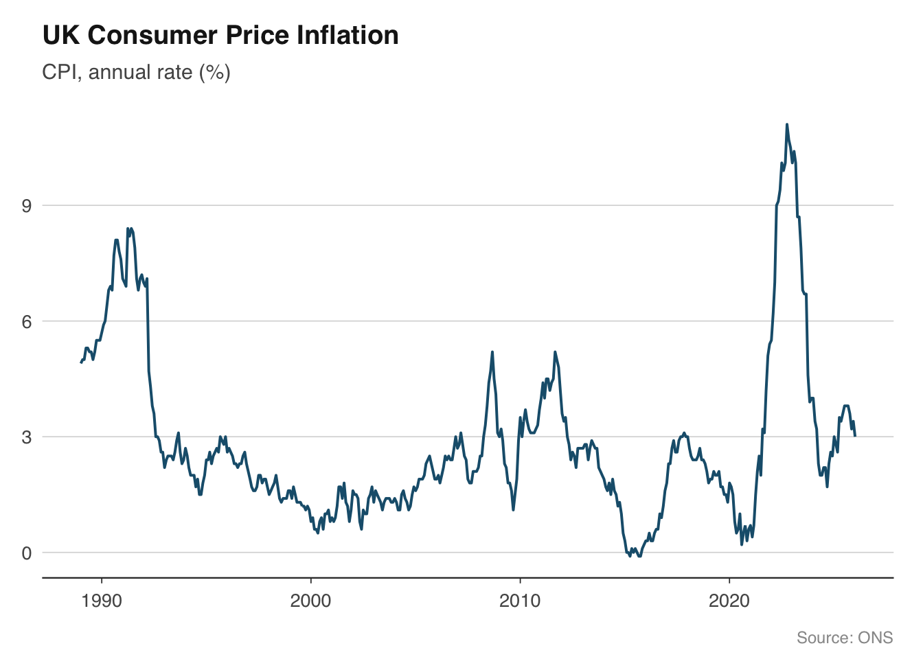
Let us put the theme to work with a simple example. The chart below plots CPI inflation — a single time series with a clean title, source caption, and no visual clutter.
```{r}
cpi <- ons_cpi()
ggplot(cpi, aes(x = date, y = value)) +
  geom_line(colour = "#1B5E7B", linewidth = 0.7) +
  labs(
    title    = "UK Consumer Price Inflation",
    subtitle = "CPI, annual rate (%)",
    x = NULL, y = NULL,
    caption  = "Source: ONS"
  ) +
  theme_macro()
```
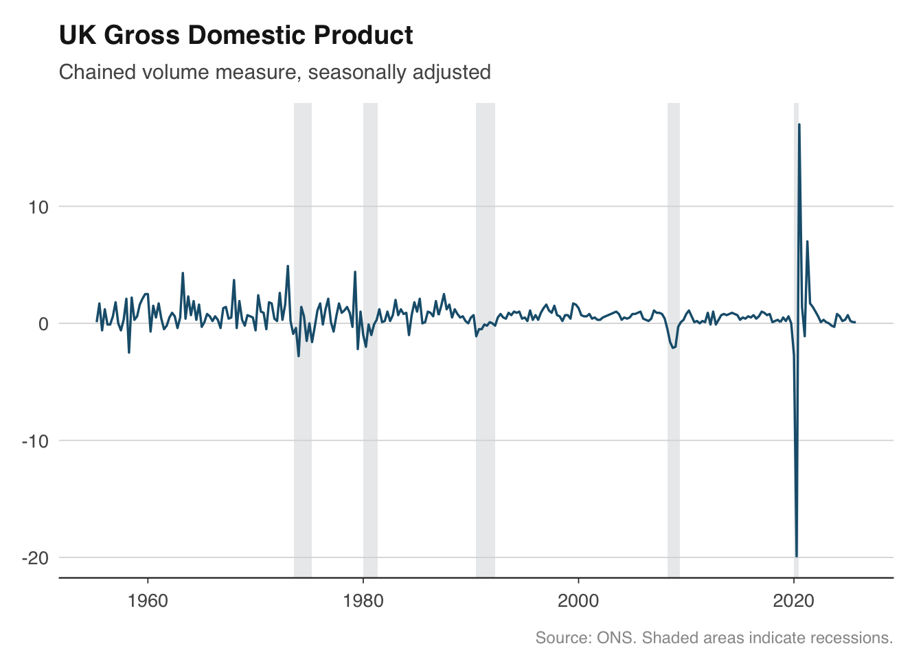
## Time series with recession shading
Recession shading is the single most requested feature for macro charts. Overlaying grey bands on periods of economic contraction gives immediate visual context — was a spike in unemployment driven by a recession, or did it happen during an expansion? The technique is straightforward: define the recession periods as a data frame of start and end dates, then draw them with `geom_rect()`.
For the United Kingdom, there is no single official recession chronology like the NBER produces for the United States. The conventional definition is two consecutive quarters of negative GDP growth. The dates below cover the major post-war recessions that are widely agreed upon by the ONS and Bank of England.
```{r}
uk_recessions <- tibble(
  start = as.Date(c(
    "1973-08-01", "1980-01-01", "1990-07-01", "2008-04-01", "2020-01-01"
  )),
  end = as.Date(c(
    "1975-04-01", "1981-05-01", "1992-04-01", "2009-06-01", "2020-06-01"
  )),
  label = c(
    "Oil crisis", "Early 1980s", "Early 1990s",
    "Global financial crisis", "COVID-19"
  )
)
```
To apply the shading, add a `geom_rect()` layer *before* the main data layer so the shading sits behind the line. Setting `ymin` and `ymax` to `-Inf` and `Inf` ensures the bands stretch across the full y-axis range regardless of the data.
```{r}
gdp <- ons_gdp()
ggplot(gdp, aes(x = date, y = value)) +
  geom_rect(
    data = uk_recessions,
    aes(xmin = start, xmax = end, ymin = -Inf, ymax = Inf),
    fill = "#D5D8DC", alpha = 0.5,
    inherit.aes = FALSE
  ) +
  geom_line(colour = "#1B5E7B", linewidth = 0.6) +
  labs(
    title    = "UK Gross Domestic Product",
    subtitle = "Chained volume measure, seasonally adjusted",
    x = NULL, y = NULL,
    caption  = "Source: ONS. Shaded areas indicate recessions."
  ) +
  theme_macro()
```
The `inherit.aes = FALSE` argument is important. Without it, ggplot will try to map the recession data frame to the aesthetic mappings defined in the main `ggplot()` call, which will fail because the recession data has different columns. This is a common source of confusion when layering different data frames in ggplot2.
You can reuse the `uk_recessions` data frame across every chart in your analysis. Some practitioners wrap the recession layer into a helper function to keep their plotting code concise:
```{r}
add_recession_shading <- function(recessions = uk_recessions,
                                  fill = "#D5D8DC", alpha = 0.5) {
  geom_rect(
    data = recessions,
    aes(xmin = start, xmax = end, ymin = -Inf, ymax = Inf),
    fill = fill, alpha = alpha,
    inherit.aes = FALSE
  )
}

# Usage: ggplot(gdp, aes(date, value)) + add_recession_shading() + geom_line()
```
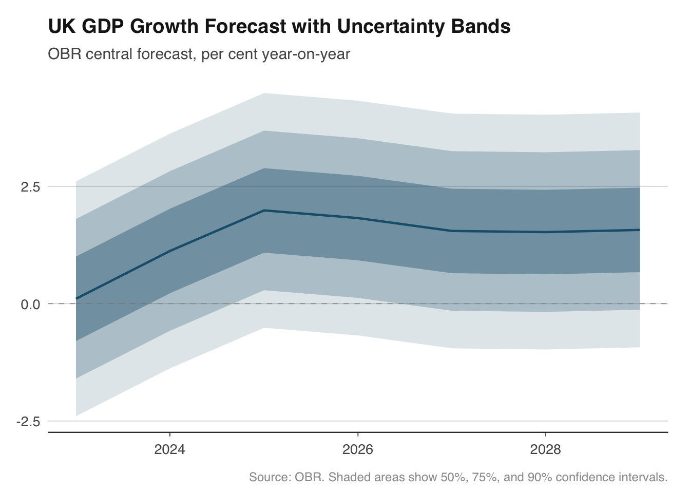
## Fan charts for forecast uncertainty
Fan charts are one of the Bank of England's most recognisable contributions to economic communication. Introduced in the 1996 Inflation Report, they show a central forecast surrounded by progressively wider bands representing increasing uncertainty. The visual message is immediate: the further out you look, the less certain we are.
The chart works by stacking `geom_ribbon()` layers, each representing a different confidence interval. The widest band (say, 90%) is drawn first in the lightest shade, then the 75% band, then the 50%, and finally the central forecast line on top. This ordering ensures narrower, darker bands are visible in front of wider, lighter ones.
To demonstrate, we will build a fan chart for UK GDP growth using OBR forecast data. In practice you would pull the OBR's forecast distribution parameters; here we simulate symmetric uncertainty bands around a central path to illustrate the technique.
```{r}
# Pull OBR GDP forecast — keep only the latest vintage
obr_gdp <- get_forecasts("real_GDP") |>
  filter(forecast_date == max(forecast_date)) |>
  mutate(date = as.Date(paste0(fiscal_year, "-01-01")))
# For illustration, create expanding uncertainty bands around the central forecast.
# In a real application you would use the OBR's published forecast distribution.
fan_data <- obr_gdp |>
  mutate(
    p90_upper = value + 2.5,
    p90_lower = value - 2.5,
    p75_upper = value + 1.7,
    p75_lower = value - 1.7,
    p50_upper = value + 0.9,
    p50_lower = value - 0.9
  )

ggplot(fan_data, aes(x = date)) +
  geom_ribbon(aes(ymin = p90_lower, ymax = p90_upper), fill = "#1B5E7B", alpha = 0.15) +
  geom_ribbon(aes(ymin = p75_lower, ymax = p75_upper), fill = "#1B5E7B", alpha = 0.25) +
  geom_ribbon(aes(ymin = p50_lower, ymax = p50_upper), fill = "#1B5E7B", alpha = 0.40) +
  geom_line(aes(y = value), colour = "#1B5E7B", linewidth = 0.8) +
  geom_hline(yintercept = 0, colour = "#999999", linewidth = 0.3, linetype = "dashed") +
  labs(
    title    = "UK GDP Growth Forecast with Uncertainty Bands",
    subtitle = "OBR central forecast, per cent year-on-year",
    x = NULL, y = NULL,
    caption  = "Source: OBR. Shaded areas show 50%, 75%, and 90% confidence intervals."
  ) +
  theme_macro()
```
The key design choices here are the use of a single hue with varying transparency rather than multiple colours. This follows the Bank of England convention and avoids the visual noise of a rainbow palette. The dashed zero line provides a reference point — viewers can immediately see when growth is expected to turn negative.
For asymmetric distributions (where risks are tilted to the upside or downside), you would use different widths above and below the central forecast. The Bank of England's fan charts are famously asymmetric, reflecting the MPC's assessment of the balance of risks. The mechanics in ggplot2 are identical — you simply set different upper and lower bounds for each ribbon.
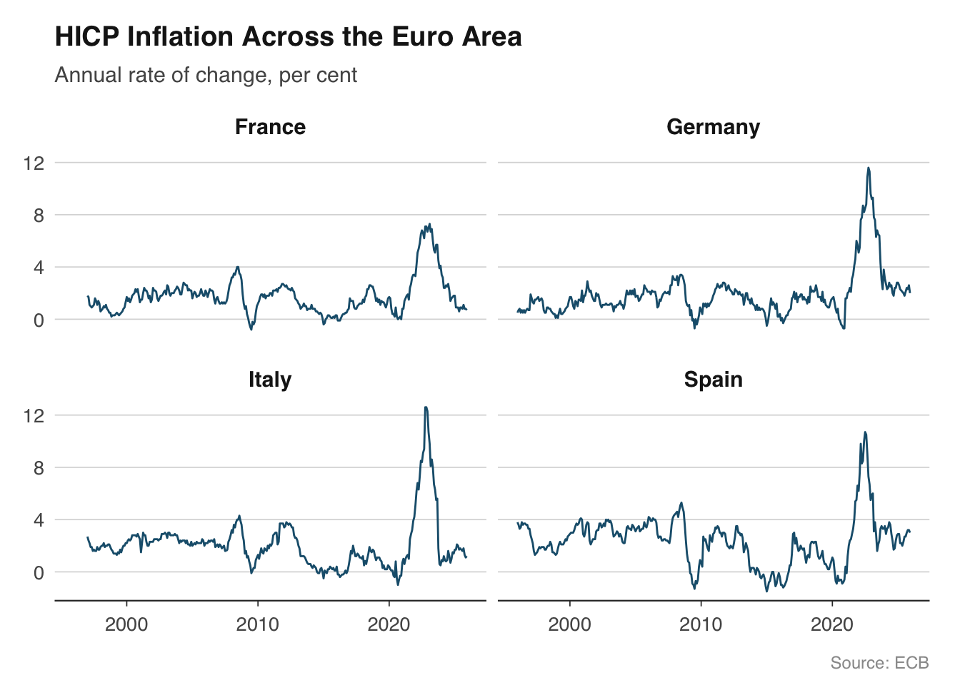
## Small multiples for cross-country comparison
Small multiples — the same chart repeated for different categories — are one of the most effective ways to compare economic trends across countries. Edward Tufte called them "the best design solution for a wide range of problems in data display," and they are ubiquitous in institutional economics: the ECB's Economic Bulletin, the IMF's World Economic Outlook, and the OECD's Economic Surveys all use them extensively.
In ggplot2, small multiples are built with `facet_wrap()` or `facet_grid()`. The approach works particularly well with the `readecb` package, which returns tidy data frames with a country or reference area column ready for faceting.
Let us plot HICP inflation for the four largest euro area economies. The ECB publishes harmonised consumer price indices for all member states, making cross-country comparison straightforward because the methodology is consistent.
```{r}
countries <- c("DE", "FR", "IT", "ES")

hicp_data <- lapply(countries, function(cc) {
  ecb_hicp(country = cc)
}) |>
  bind_rows()
# Map country codes to readable names
country_names <- c(
  DE = "Germany", FR = "France",
  IT = "Italy",   ES = "Spain"
)
hicp_data <- hicp_data |>
  mutate(country = country_names[country])

ggplot(hicp_data, aes(x = date, y = value)) +
  geom_line(colour = "#1B5E7B", linewidth = 0.5) +
  facet_wrap(~ country, ncol = 2) +
  labs(
    title    = "HICP Inflation Across the Euro Area",
    subtitle = "Annual rate of change, per cent",
    x = NULL, y = NULL,
    caption  = "Source: ECB"
  ) +
  theme_macro() +
  theme(strip.text = element_text(face = "bold", size = rel(0.95)))
```
Several design choices make this chart work. First, all four panels share the same y-axis scale (the default in `facet_wrap()`), which allows genuine comparison of levels. If one country's inflation was persistently higher, it would be immediately visible. Second, we use a single colour because the facet labels already identify each country — adding colour would be redundant. Third, the panels are arranged in a 2x2 grid, which keeps each panel wide enough for the time axis to remain legible.
If the scales are very different across countries — for example, when comparing GDP levels rather than growth rates — you can use `facet_wrap(~ country, scales = "free_y")`. But use this sparingly, because it makes it harder to compare magnitudes across panels. A note in the subtitle or caption is essential when scales differ.
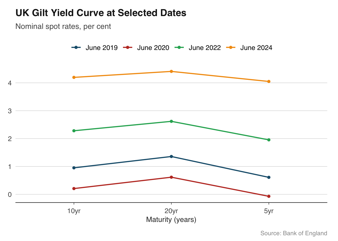
## Yield curve snapshots
The yield curve — the relationship between government bond yields and their maturity — is one of the most closely watched indicators in finance and macroeconomics. Its shape carries information about market expectations for interest rates, inflation, and growth. An inverted yield curve, where short-term yields exceed long-term yields, has preceded every US recession since the 1960s.
Plotting multiple yield curves on the same chart at different points in time shows how expectations have shifted. This is far more informative than a single snapshot. The `boe_yield_curve()` function from the `boe` package returns gilt yields at various maturities, making it straightforward to build these overlays.
```{r}
# Pull yield curve data for selected dates
yield_data <- boe_yield_curve(from = "2019-01-01")
# Select specific dates to plot
snapshot_dates <- as.Date(c("2019-06-28", "2020-06-30", "2022-06-30", "2024-06-28"))

yield_snapshots <- yield_data |>
  filter(date %in% snapshot_dates) |>
  mutate(date_label = format(date, "%B %Y"))

ggplot(yield_snapshots, aes(x = maturity, y = yield_pct, colour = date_label, group = date_label)) +
  geom_line(linewidth = 0.8) +
  geom_point(size = 1.5) +
  scale_colour_macro() +
  labs(
    title    = "UK Gilt Yield Curve at Selected Dates",
    subtitle = "Nominal spot rates, per cent",
    x = "Maturity (years)", y = NULL,
    caption  = "Source: Bank of England"
  ) +
  theme_macro()
```
The chart immediately reveals the story of UK monetary policy across these dates. In mid-2019, the curve was relatively flat, reflecting expectations that rates would remain low. By mid-2022, the curve had shifted sharply upward as inflation surged and the Bank of England tightened policy. Overlaying curves in this way is more effective than plotting a single maturity over time, because it shows the entire term structure at a glance.
When working with yield curve data, pay attention to the x-axis. Maturities are not evenly spaced — there are more data points at the short end (1, 2, 3, 5 years) than the long end (10, 20, 30 years). A linear scale is standard, but the points will cluster at shorter maturities. Adding `geom_point()` helps mark the actual data points and avoids suggesting false precision between observations.
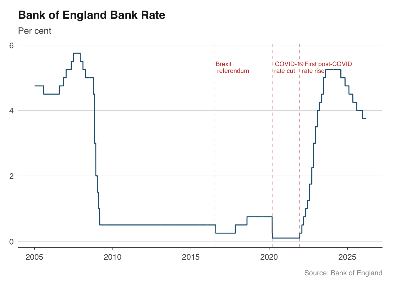
## Annotating key events
Time series charts become much more informative when key events are marked directly on the plot. Rather than forcing readers to remember that the UK left the EU on 31 January 2020, or that the Bank of England cut rates to 0.1% in March 2020, you can annotate these events on the chart itself. This is particularly valuable in publications where charts need to be self-contained.
The two main tools are `geom_vline()` for vertical reference lines and `annotate()` for text labels. Vertical lines are best drawn as thin dashed lines in a neutral colour so they do not compete with the data. Text annotations should be brief — a few words at most — and positioned to avoid overlapping the data.
```{r}
bank_rate <- boe_bank_rate()
events <- tibble(
  date = as.Date(c("2016-06-23", "2020-03-11", "2021-12-16")),
  label = c("Brexit\nreferendum", "COVID-19\nrate cut", "First post-COVID\nrate rise"),
  y_pos = c(5.5, 5.5, 5.5)
)

ggplot(bank_rate |> filter(date >= as.Date("2005-01-01")),
       aes(x = date, y = rate_pct)) +
  geom_line(colour = "#1B5E7B", linewidth = 0.6) +
  geom_vline(
    data = events, aes(xintercept = date),
    colour = "#C0392B", linewidth = 0.3, linetype = "dashed"
  ) +
  geom_text(
    data = events,
    aes(x = date, y = y_pos, label = label),
    hjust = -0.1, vjust = 1, size = 2.8, colour = "#C0392B",
    family = "Helvetica", lineheight = 0.9
  ) +
  labs(
    title    = "Bank of England Bank Rate",
    subtitle = "Per cent",
    x = NULL, y = NULL,
    caption  = "Source: Bank of England"
  ) +
  theme_macro()
```
A few practical tips for annotations. First, use `\n` in label text to break long labels across two lines rather than letting them run off the chart. Second, `hjust` and `vjust` control the anchor point — `hjust = -0.1` places the text just to the right of the vertical line, which is the conventional position. Third, keep annotation text short and factual. The chart should prompt the reader to think, not do their thinking for them.
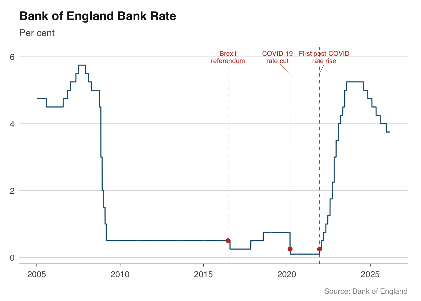
For charts with many events, consider using `ggrepel::geom_text_repel()` to automatically avoid overlapping labels. This is especially useful for dense time series where multiple events cluster together.
```{r}
# Alternative with ggrepel for automatic label placement
library(ggrepel)

ggplot(bank_rate |> filter(date >= as.Date("2005-01-01")),
       aes(x = date, y = rate_pct)) +
  geom_line(colour = "#1B5E7B", linewidth = 0.6) +
  geom_vline(
    data = events, aes(xintercept = date),
    colour = "#C0392B", linewidth = 0.3, linetype = "dashed"
  ) +
  geom_point(
    data = bank_rate |> filter(date %in% events$date),
    aes(x = date, y = rate_pct),
    colour = "#C0392B", size = 2,
    inherit.aes = FALSE
  ) +
  geom_text_repel(
    data = events,
    aes(x = date, y = y_pos, label = label),
    size = 2.8, colour = "#C0392B",
    family = "Helvetica", lineheight = 0.9,
    nudge_y = 0.5, segment.colour = "#C0392B", segment.size = 0.2
  ) +
  labs(
    title    = "Bank of England Bank Rate",
    subtitle = "Per cent",
    x = NULL, y = NULL,
    caption  = "Source: Bank of England"
  ) +
  theme_macro()
```
::: {.callout-warning}
## A note on dual-axis charts
Dual-axis charts — where the left and right y-axes show different scales — are common in financial journalism but widely criticised by statisticians. The problem is that the visual relationship between two series on a dual-axis chart is entirely determined by the arbitrary choice of axis scales. By adjusting the ranges, you can make any two series appear to be correlated, uncorrelated, or inversely correlated.
A better approach is to use facets: plot each series in its own panel with an independent y-axis. The reader can still compare timing and direction, but the chart does not imply a spurious quantitative relationship. `facet_wrap(scales = "free_y")` handles this cleanly.
:::
## Exercises
1. Build a chart of UK GDP growth with recession periods shaded in grey. Calculate quarter-on-quarter growth rates from `ons_gdp()` and overlay the recession bands from this chapter. Add a horizontal dashed line at zero.
2. Create a fan chart showing the OBR's GDP growth forecast with uncertainty bands. Experiment with different colour palettes — try a warm palette (reds/oranges) alongside the blue version from the chapter. Which is more readable?
3. Plot HICP inflation for Germany, France, Italy, and Spain as small multiples using `facet_wrap()`. Add a horizontal reference line at 2% (the ECB's target) to each panel.
4. Pull yield curve data from the Bank of England for the first business day of each quarter in 2023. Overlay all four curves on a single chart and describe what the changing shape tells you about market expectations.
5. Take any time series chart from this chapter and annotate at least three macroeconomic events of your choice. Practice positioning the labels so they do not overlap the data.