8 Monetary Policy and Interest Rates
Central banks set interest rates. But how do we know if rates are too high, too low, or about right? This chapter covers the Taylor rule, yield curve analysis, and event studies around rate decisions. These are the tools that market economists, central bank watchers, and policy analysts use every day.
8.1 The Taylor rule
In 1993, John Taylor proposed a simple rule to describe how central banks set interest rates. The Taylor rule says the nominal interest rate should respond to two things: the deviation of inflation from its target, and the deviation of output from its potential. The rule takes the form:
\[i_t = r^* + \pi_t + \phi_\pi (\pi_t - \pi^*) + \phi_y (y_t - y_t^n)\]
where \(i_t\) is the nominal policy rate, \(r^*\) is the equilibrium real interest rate, \(\pi_t\) is the current inflation rate, \(\pi^*\) is the inflation target, \((y_t - y_t^n)\) is the output gap (the percentage deviation of actual GDP from potential GDP), and \(\phi_\pi\) and \(\phi_y\) are response coefficients.
Taylor’s original calibration used \(r^* = 2\), \(\pi^* = 2\), \(\phi_\pi = 0.5\), and \(\phi_y = 0.5\). The coefficient \(\phi_\pi = 0.5\) means that for every 1 percentage point that inflation exceeds the target, the central bank raises the nominal rate by 1.5 percentage points (1 from the inflation term itself, plus 0.5 from the response). This more-than-one-for-one response — known as the Taylor principle — ensures that the real interest rate rises when inflation rises, which is necessary for monetary policy to stabilise the economy.
The output gap term captures the dual mandate logic: even if inflation is on target, the central bank should ease policy when output is below potential (to support recovery) and tighten when output is above potential (to prevent overheating). The beauty of the Taylor rule is its simplicity — it reduces the complex deliberations of a monetary policy committee to a formula with two observable inputs.
Of course, no central bank mechanically follows the Taylor rule. But comparing the actual policy rate to the Taylor-implied rate reveals when policy was unusually loose or tight, and can shed light on the motivations behind unconventional decisions.
8.2 Estimating a Taylor rule for the UK
To compute a Taylor-implied rate for the UK, we need three ingredients: the Bank Rate (from boe), CPI inflation (from ons), and an output gap. We constructed an HP-filter output gap in Chapter 4; here we build one from scratch.
First, we compute annual CPI inflation from the index level:
# ons_cpi() already returns the annual CPI inflation rate
inflation <- cpi |>
  arrange(date) |>
  rename(inflation = value)
Next, we construct the output gap using a Hodrick-Prescott filter. The HP filter decomposes a time series into a trend component and a cyclical component. For quarterly data, the conventional smoothing parameter is \(\lambda = 1600\).
library(mFilter)

# ons_gdp(measure = "level") gives the GDP index level for HP filtering
gdp_level <- ons_gdp(measure = "level") |>
  arrange(date) |>
  filter(!is.na(value))

hp <- hpfilter(gdp_level$value, freq = 1600)

gdp_gap <- gdp_level |>
  mutate(
    trend = as.numeric(hp$trend),
    output_gap = (value - trend) / trend * 100
  ) |>
  select(date, output_gap)
Now we assemble the Taylor rule. We set the UK inflation target at 2% (the Bank of England’s target since 2003) and the equilibrium real rate at 2% — though the latter is subject to considerable debate, with many economists arguing it has fallen since the financial crisis.
# Taylor rule parameters
r_star <- 2      # equilibrium real rate
pi_star <- 2     # inflation target
phi_pi <- 0.5    # response to inflation gap
phi_y <- 0.5     # response to output gap

# Merge inflation and output gap
# GDP is quarterly, so we convert inflation to quarterly by taking end-of-quarter
taylor_data <- inflation |>
  mutate(quarter_date = floor_date(date, "quarter")) |>
  group_by(quarter_date) |>
  slice_tail(n = 1) |>
  ungroup() |>
  inner_join(gdp_gap, by = c("quarter_date" = "date")) |>
  mutate(
    taylor_rate = r_star + inflation + phi_pi * (inflation - pi_star) + phi_y * output_gap
  )

# Merge with actual Bank Rate (take end-of-quarter observation)
bank_rate_q <- bank_rate |>
  mutate(quarter_date = floor_date(date, "quarter")) |>
  group_by(quarter_date) |>
  slice_tail(n = 1) |>
  ungroup() |>
  select(quarter_date, bank_rate = rate_pct)

taylor_data <- taylor_data |>
  left_join(bank_rate_q, by = "quarter_date")
We can now plot the actual Bank Rate against the Taylor-implied rate:
ggplot(taylor_data, aes(x = quarter_date)) +
  geom_line(aes(y = bank_rate, colour = "Bank Rate"), linewidth = 0.8) +
  geom_line(aes(y = taylor_rate, colour = "Taylor rule"), linewidth = 0.8) +
  scale_colour_manual(values = c("Bank Rate" = "#2c3e50", "Taylor rule" = "#e74c3c")) +
  labs(
    x = NULL,
    y = "Interest rate (%)",
    colour = NULL
  ) +
  theme_macro() +
  theme(legend.position = "bottom")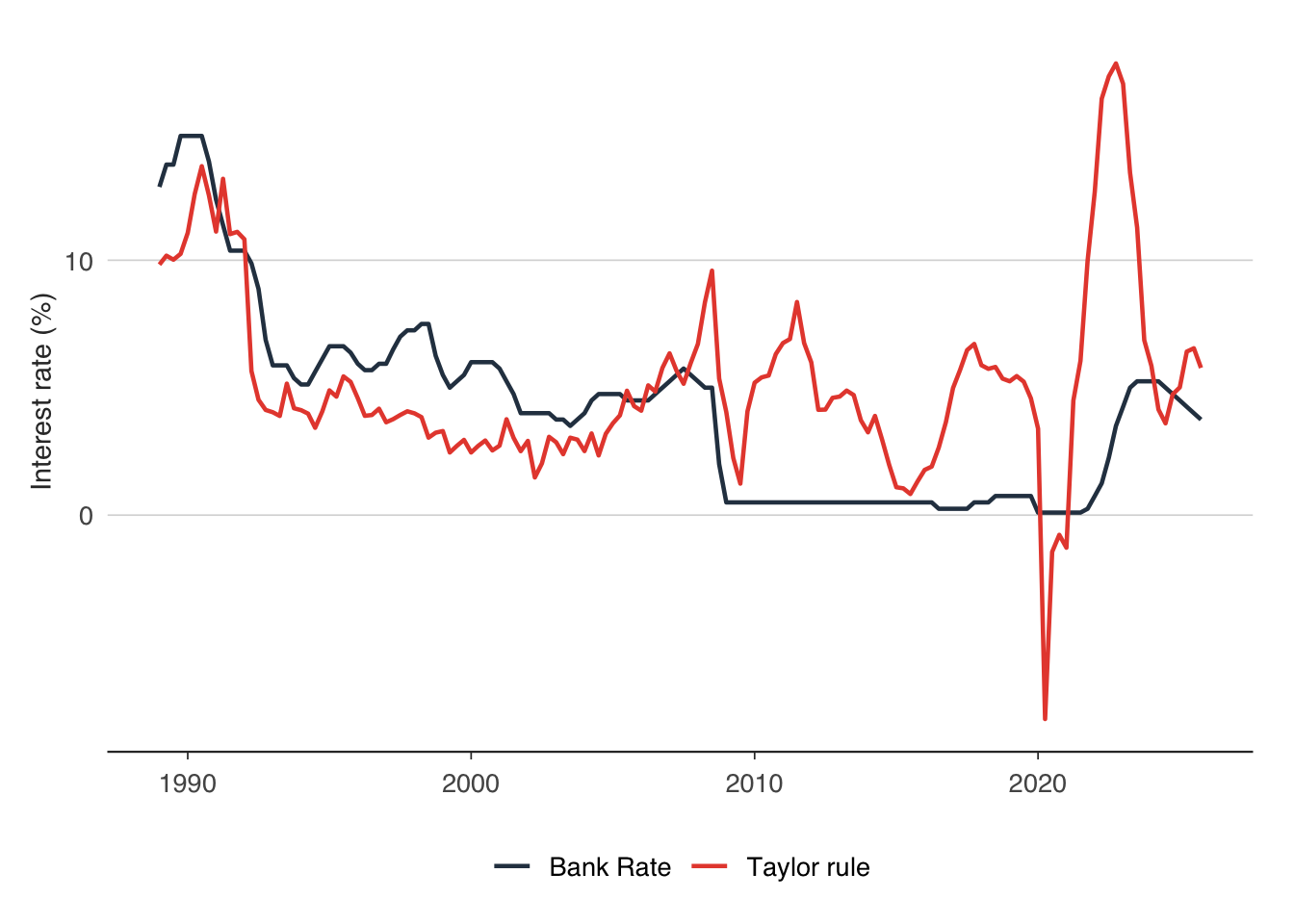
The chart typically reveals several interesting episodes. Before the financial crisis, the Bank Rate and the Taylor rate tracked each other reasonably well — the Bank of England was behaving roughly as the Taylor rule prescribed. After 2009, a large gap opens up: the Taylor rule often implies negative interest rates (because the output gap was deeply negative and inflation was low), but the Bank Rate was stuck at the zero lower bound. This is the period of quantitative easing — the Bank could not cut rates further, so it turned to asset purchases instead.
The post-pandemic period is equally revealing. As inflation surged above 10% in 2022, the Taylor rule implied rates far above the Bank Rate. The gap suggests that the Bank of England was unusually accommodative relative to a simple rule, though this partly reflects the difficulty of calibrating \(r^*\) in real time.
We can also estimate the Taylor rule coefficients rather than imposing them:
Call:
lm(formula = bank_rate ~ inflation + output_gap, data = taylor_data)

Residuals:
    Min      1Q  Median      3Q     Max
-7.5139 -3.2473  0.6503  2.1563  8.6645

Coefficients:
            Estimate Std. Error t value Pr(>|t|)
(Intercept)   2.4006     0.4726   5.079 1.15e-06 ***
inflation     0.6354     0.1342   4.733 5.20e-06 ***
output_gap    0.1578     0.1247   1.265    0.208
---
Signif. codes:  0 '***' 0.001 '**' 0.01 '*' 0.05 '.' 0.1 ' ' 1

Residual standard error: 3.415 on 145 degrees of freedom
Multiple R-squared:  0.162, Adjusted R-squared:  0.1505
F-statistic: 14.02 on 2 and 145 DF,  p-value: 2.719e-06
The estimated \(\phi_\pi\) tells us how aggressively the Bank of England actually responded to inflation deviations, compared with Taylor’s benchmark of 0.5. If the estimated coefficient on inflation exceeds 1 (recall the inflation term also enters directly), the Taylor principle holds — the Bank raised real rates in response to rising inflation.
8.3 Estimating a Taylor rule for the euro area
The same framework applies to the European Central Bank. We use readecb to pull the ECB’s main refinancing rate and HICP inflation:
library(readecb)

ecb_rates <- ecb_policy_rates()
hicp <- ecb_hicp()
The ECB targets HICP inflation “below, but close to, 2%” (since 2021, symmetrically at 2%). We use the same Taylor rule parameters for comparability, though the ECB’s reaction function may differ from the Bank of England’s.
# ecb_hicp() already returns the annual inflation rate for the euro area (U2)
ea_inflation <- hicp |>
  arrange(date) |>
  rename(inflation = value)

# Extract the main refinancing rate
mro <- ecb_rates |>
  filter(rate == "Main refinancing rate") |>
  select(date, ecb_rate = value)

# Merge and compute Taylor rate (using inflation gap only, as EA output gap is harder to construct)
ea_taylor <- ea_inflation |>
  mutate(quarter_date = floor_date(date, "quarter")) |>
  group_by(quarter_date) |>
  slice_tail(n = 1) |>
  ungroup() |>
  mutate(
    taylor_rate = r_star + inflation + phi_pi * (inflation - pi_star)
  )

ea_taylor <- ea_taylor |>
  left_join(
    mro |> mutate(quarter_date = floor_date(date, "quarter")) |>
      group_by(quarter_date) |> slice_tail(n = 1) |> ungroup() |>
      select(quarter_date, ecb_rate),
    by = "quarter_date"
)ggplot(ea_taylor, aes(x = quarter_date)) +
geom_line(aes(y = ecb_rate, colour = "ECB MRO rate"), linewidth = 0.8) +
geom_line(aes(y = taylor_rate, colour = "Taylor rule"), linewidth = 0.8) +
scale_colour_manual(values = c("ECB MRO rate" = "#2c3e50", "Taylor rule" = "#e74c3c")) +
labs(
x = NULL,
y = "Interest rate (%)",
colour = NULL
) +
theme_macro() +
theme(legend.position = "bottom")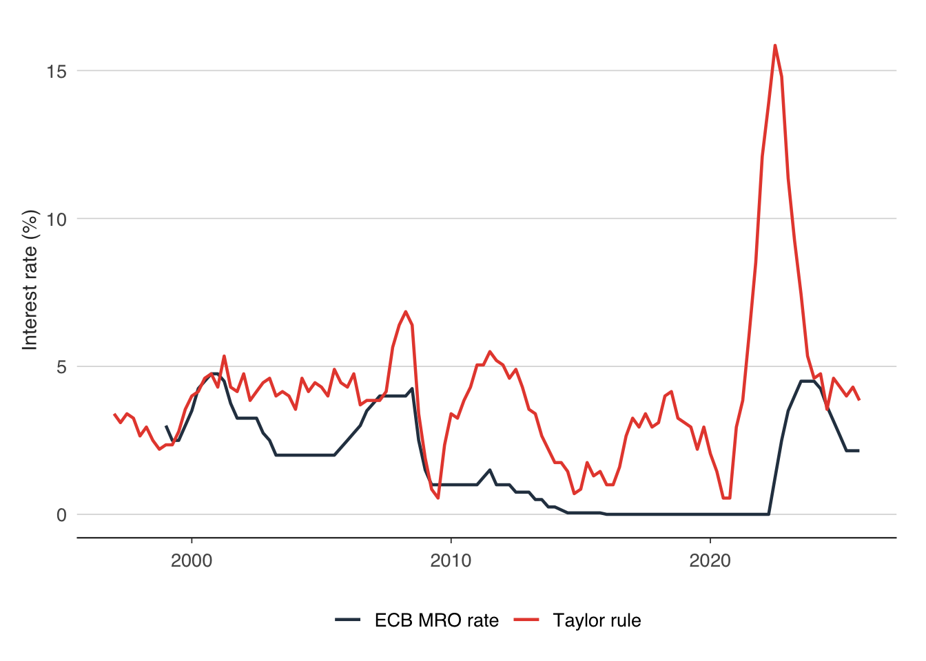
Comparing the two charts — UK and euro area — reveals how different central banks navigated the same global shocks. The ECB was often criticised for being too slow to cut rates during the euro area debt crisis (2010–2012) and too slow to raise them during the post-pandemic inflation surge. The Taylor rule provides a benchmark against which to evaluate these judgements.
8.4 The yield curve as a recession predictor
The yield curve — the relationship between bond yields and their maturity — contains information about the market’s expectations for future interest rates and economic conditions. When the yield curve inverts (short-term yields exceed long-term yields), a recession has historically followed within 12–24 months.
The logic runs through the expectations hypothesis of the term structure. Long-term yields should equal the average of expected future short-term rates plus a term premium. If markets expect the central bank to cut rates sharply in the future — because they expect a recession — then long-term yields fall below short-term yields, and the curve inverts.
The most commonly watched measure is the 10-year minus 2-year spread (the “2s10s”). We can compute this from Bank of England gilt yield data:
# boe_yield_curve() provides 5yr, 10yr, and 20yr maturities
# We use the 5yr-10yr spread as a proxy for the short-long spread
gilts <- boe_yield_curve()

spread <- gilts |>
  filter(maturity %in% c("5yr", "10yr")) |>
  select(date, maturity, yield = yield_pct) |>
  tidyr::pivot_wider(names_from = maturity, values_from = yield) |>
  rename(y5 = `5yr`, y10 = `10yr`) |>
mutate(spread_2s10s = y10 - y5)ggplot(spread, aes(x = date, y = spread_2s10s)) +
geom_line(colour = "#2c3e50", linewidth = 0.6) +
geom_hline(yintercept = 0, linetype = "dashed", colour = "#e74c3c") +
annotate("rect", xmin = as.Date("2008-04-01"), xmax = as.Date("2009-06-01"),
ymin = -Inf, ymax = Inf, alpha = 0.15, fill = "grey50") +
annotate("rect", xmin = as.Date("2020-02-01"), xmax = as.Date("2020-06-01"),
ymin = -Inf, ymax = Inf, alpha = 0.15, fill = "grey50") +
labs(
x = NULL,
y = "Spread (percentage points)"
) +
theme_macro()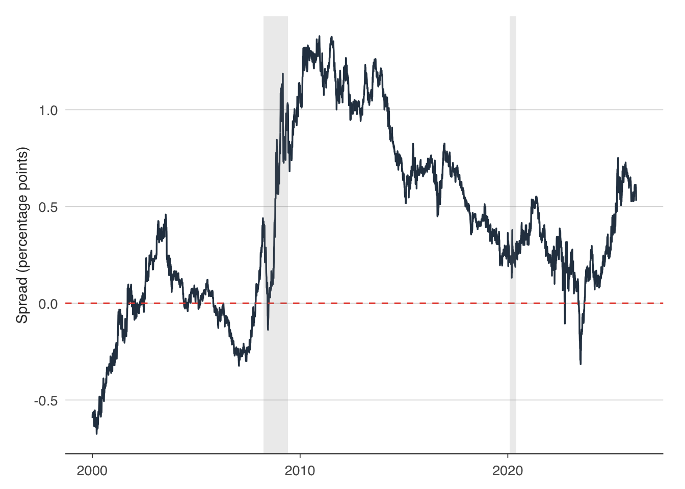
The grey shaded areas mark UK recessions. Note how the spread tends to turn negative or approach zero before each recession. The financial crisis of 2008–09 and the pandemic recession of 2020 were both preceded by a flattening or inversion of the curve.
We can formalise this relationship with a probit model. The dependent variable is a binary recession indicator (1 if the UK was in recession, 0 otherwise), and the explanatory variable is the yield curve spread, lagged by 4 quarters to test the predictive relationship.
# Construct a simple recession indicator from GDP
# ons_gdp() already returns quarter-on-quarter growth
gdp_growth <- gdp |>
  arrange(date) |>
  rename(growth = value) |>
  mutate(recession = as.integer(growth < 0))

# Merge with the spread (quarterly)
probit_data <- spread |>
  mutate(quarter_date = floor_date(date, "quarter")) |>
  group_by(quarter_date) |>
  summarise(spread_2s10s = mean(spread_2s10s, na.rm = TRUE), .groups = "drop") |>
  mutate(spread_lag4 = lag(spread_2s10s, 4)) |>
  inner_join(
    gdp_growth |> select(date, recession),
    by = c("quarter_date" = "date")
  ) |>
  filter(!is.na(spread_lag4))

# Estimate probit
probit_model <- glm(recession ~ spread_lag4, data = probit_data,
                    family = binomial(link = "probit"))
summary(probit_model)
Call:
glm(formula = recession ~ spread_lag4, family = binomial(link = "probit"),
    data = probit_data)

Coefficients:
            Estimate Std. Error z value Pr(>|z|)
(Intercept)  -1.0665     0.2064  -5.168 2.37e-07 ***
spread_lag4  -0.2923     0.3600  -0.812    0.417
---
Signif. codes:  0 '***' 0.001 '**' 0.01 '*' 0.05 '.' 0.1 ' ' 1

(Dispersion parameter for binomial family taken to be 1)

    Null deviance: 73.385  on 99  degrees of freedom
Residual deviance: 72.718  on 98  degrees of freedom
AIC: 76.718

Number of Fisher Scoring iterations: 4
A negative coefficient on the spread confirms that a lower (or negative) spread predicts a higher probability of recession. We can compute the implied recession probability and plot it:
probit_data <- probit_data |>
  mutate(recession_prob = predict(probit_model, type = "response"))

ggplot(probit_data, aes(x = quarter_date)) +
  geom_line(aes(y = recession_prob), colour = "#e74c3c", linewidth = 0.8) +
  geom_hline(yintercept = 0.5, linetype = "dashed", colour = "grey50") +
  labs(
    x = NULL,
    y = "Predicted recession probability"
  ) +
  theme_macro()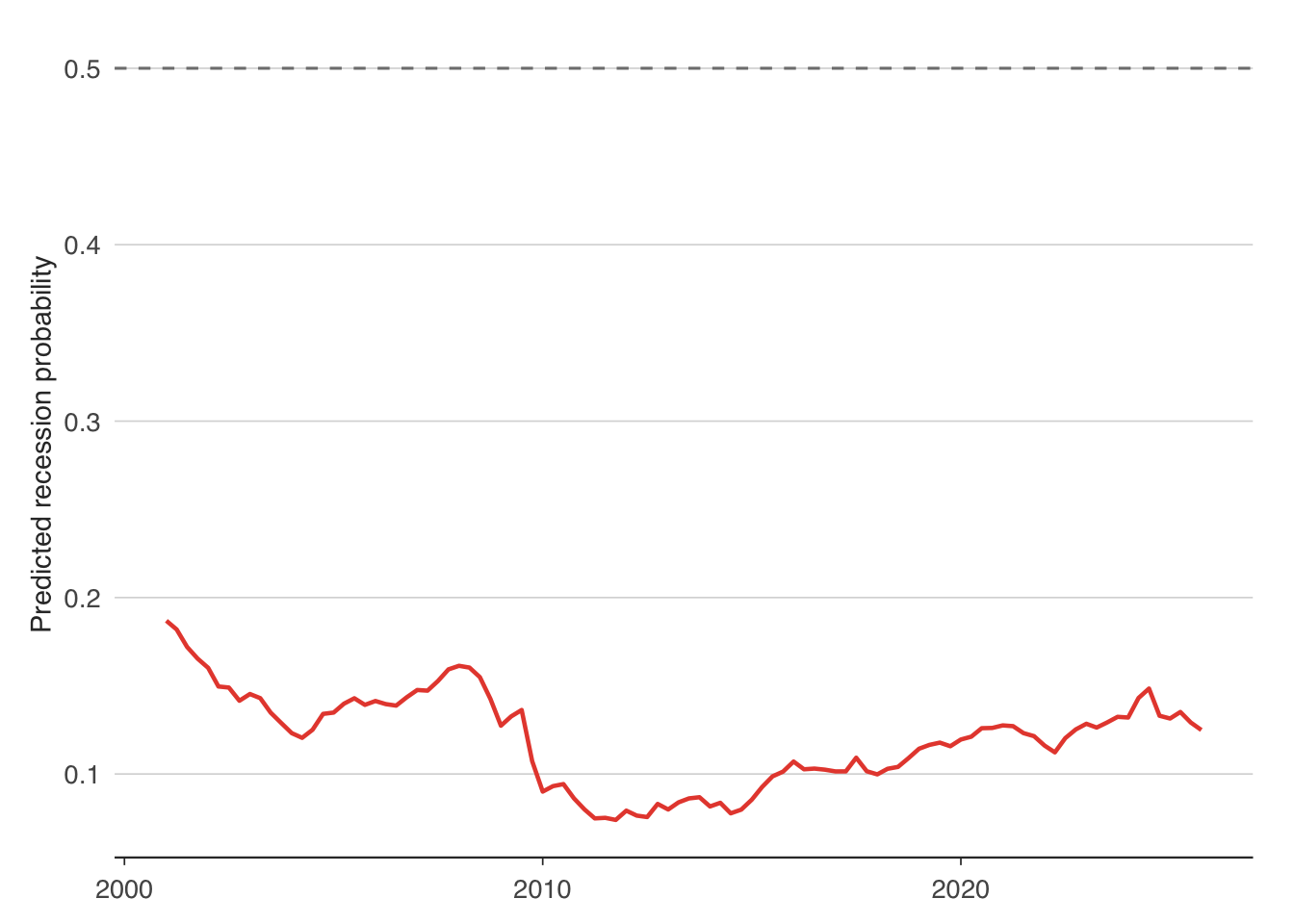
The chart shows the model’s implied recession probability over time. Spikes above 50% correspond to periods when the model was signalling elevated recession risk. The yield curve is not a perfect predictor — it can produce false positives, and the timing varies — but it is one of the most reliable leading indicators available.
8.5 Nelson-Siegel term structure models
While the yield spread is a useful summary statistic, it discards most of the information in the yield curve. The Nelson-Siegel model (1987) provides a parsimonious representation of the entire curve using just three parameters:
\[y(\tau) = \beta_1 + \beta_2 \left(\frac{1 - e^{-\lambda\tau}}{\lambda\tau}\right) + \beta_3 \left(\frac{1 - e^{-\lambda\tau}}{\lambda\tau} - e^{-\lambda\tau}\right)\]
where \(y(\tau)\) is the yield at maturity \(\tau\), and the three parameters have intuitive economic interpretations. \(\beta_1\) is the long-run level — as \(\tau \to \infty\), the yield converges to \(\beta_1\). \(\beta_2\) captures the slope — it determines the difference between short-term and long-term yields. \(\beta_3\) captures the curvature — it determines the “hump” in the yield curve at intermediate maturities. The parameter \(\lambda\) governs where the curvature peaks.
These three factors correspond to the “level, slope, and curvature” that practitioners routinely discuss. Changes in the level shift the entire curve up or down (reflecting changes in long-run inflation or real rate expectations). Changes in the slope tilt the curve (reflecting monetary policy expectations). Changes in the curvature alter the mid-section of the curve (reflecting term premium or risk appetite shifts).
We fit the Nelson-Siegel model to a cross-section of UK gilt yields using nonlinear least squares:
# Get a cross-section of yields at a single date
# Convert maturity from "5yr"/"10yr"/"20yr" to numeric
gilts_cross <- gilts |>
  filter(date == max(date)) |>
  mutate(maturity_yrs = as.numeric(gsub("yr", "", maturity))) |>
  select(maturity = maturity_yrs, yield = yield_pct) |>
  filter(!is.na(yield), maturity > 0)

# Nelson-Siegel function
nelson_siegel <- function(tau, beta1, beta2, beta3, lambda) {
  x <- lambda * tau
  factor1 <- (1 - exp(-x)) / x
  factor2 <- factor1 - exp(-x)
  beta1 + beta2 * factor1 + beta3 * factor2
}

# With 3 maturities we fix lambda and solve the linear system directly
lambda <- 0.5
X_ns <- matrix(NA, nrow(gilts_cross), 3)
for (i in seq_len(nrow(gilts_cross))) {
  tau <- gilts_cross$maturity[i]
  x <- lambda * tau
  f1 <- (1 - exp(-x)) / x
  f2 <- f1 - exp(-x)
  X_ns[i, ] <- c(1, f1, f2)
}
ns_coefs <- solve(X_ns, gilts_cross$yield)
names(ns_coefs) <- c("beta1", "beta2", "beta3")
print(ns_coefs)
beta1 beta2 beta3
5.71191276 0.07446438 -5.82449739 The fitted parameters tell us about the shape of the yield curve on that date. A positive \(\beta_1\) indicates the long-run yield level. A negative \(\beta_2\) implies an upward-sloping curve (short rates below long rates). The sign and magnitude of \(\beta_3\) tell us whether there is a hump or a trough at intermediate maturities.
We can plot the fitted curve against the actual yields:
tau_grid <- seq(0.5, 30, by = 0.1)
fitted_yields <- sapply(tau_grid, function(tau) {
  nelson_siegel(tau, ns_coefs["beta1"], ns_coefs["beta2"],
                ns_coefs["beta3"], lambda)
})

ns_plot_data <- tibble(maturity = tau_grid, fitted = fitted_yields)

ggplot() +
  geom_point(data = gilts_cross, aes(x = maturity, y = yield),
             colour = "#2c3e50", size = 2.5) +
  geom_line(data = ns_plot_data, aes(x = maturity, y = fitted),
            colour = "#e74c3c", linewidth = 0.8) +
  labs(
    x = "Maturity (years)",
    y = "Yield (%)"
  ) +
  theme_macro()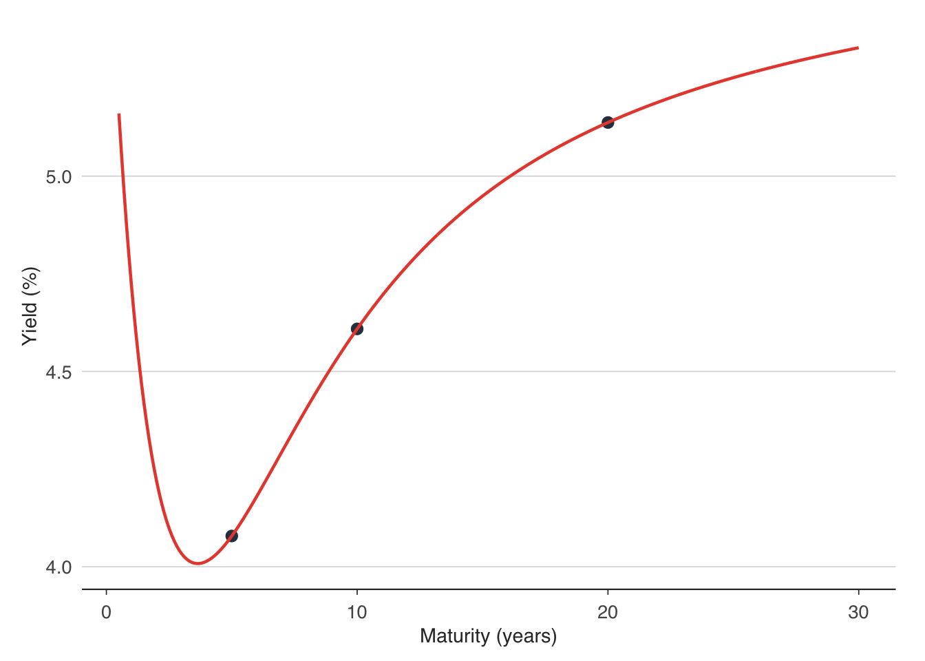
The Nelson-Siegel model fits the yield curve remarkably well with only three parameters (plus \(\lambda\)). This is why it is widely used by central banks and fixed-income practitioners for yield curve interpolation, forecasting, and risk analysis. The Bank of England, ECB, and Bank for International Settlements all publish Nelson-Siegel or Svensson (an extended version with additional curvature terms) decompositions.
To track the evolution of the yield curve over time, we can fit the model to each date in our sample and plot the three factors:
# Fit Nelson-Siegel to each date by solving the linear system (lambda fixed)
fit_ns <- function(mats, yields, lam = 0.5) {
  X <- matrix(NA, length(mats), 3)
  for (i in seq_along(mats)) {
    x <- lam * mats[i]
    f1 <- (1 - exp(-x)) / x
    f2 <- f1 - exp(-x)
    X[i, ] <- c(1, f1, f2)
  }
  tryCatch(
    { b <- solve(X, yields); c(beta1 = b[1], beta2 = b[2], beta3 = b[3]) },
    error = function(e) c(beta1 = NA, beta2 = NA, beta3 = NA)
  )
}

ns_over_time <- gilts |>
  mutate(maturity_yrs = as.numeric(gsub("yr", "", maturity))) |>
  filter(!is.na(yield_pct), maturity_yrs > 0) |>
  group_by(date) |>
  filter(n() >= 3) |>
  summarise(
    ns = list(fit_ns(maturity_yrs, yield_pct)),
    .groups = "drop"
  ) |>
  tidyr::unnest_wider(ns)
8.6 Event studies around rate decisions
An event study examines how asset prices respond to a specific event — in this case, a Bank of England interest rate decision. The idea is simple: if markets perfectly anticipated the decision, yields should not move. If the decision surprised markets, we should see a sharp move in yields on the announcement day.
We pick three notable Bank of England rate decisions and examine gilt yield movements in a 5-day window around each:
# Define three notable BoE decisions
events <- tibble(
  date = as.Date(c("2022-02-03", "2022-08-04", "2023-08-03")),
  label = c(
    "Feb 2022: 25bp hike to 0.50%",
    "Aug 2022: 50bp hike to 1.75%",
    "Aug 2023: 25bp hike to 5.25%"
  )
)

# Pull daily gilt yields
gilts_daily <- boe_yield_curve()

# For each event, extract yields in a window
event_windows <- purrr::pmap_dfr(events, function(date, label) {
  gilts_daily |>
    filter(
      .data$date >= !!date - 7,
      .data$date <= !!date + 7,
      maturity %in% c("5yr", "10yr", "20yr")
    ) |>
    mutate(
      event_date = !!date,
      event_label = !!label,
      days_from_event = as.numeric(.data$date - !!date)
    )
})ggplot(event_windows, aes(x = days_from_event, y = yield_pct,
colour = maturity, group = maturity)) +
geom_line(linewidth = 0.8) +
geom_vline(xintercept = 0, linetype = "dashed", colour = "grey50") +
facet_wrap(~event_label, scales = "free_y", ncol = 1) +
scale_colour_manual(
values = c("5yr" = "#3498db", "10yr" = "#2ecc71", "20yr" = "#e74c3c"),
labels = c("5-year", "10-year", "20-year")
) +
labs(
x = "Days from decision",
y = "Yield (%)",
colour = "Maturity"
) +
theme_macro() +
theme(legend.position = "bottom")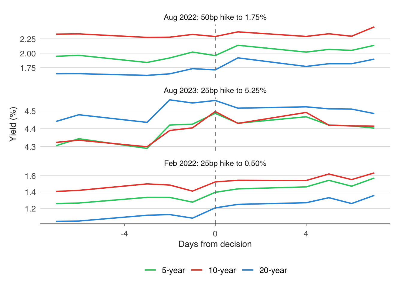
The event study reveals several things. First, look at the 2-year yield, which is most sensitive to monetary policy expectations. If it moves sharply on the day of the announcement (day 0), the decision contained a genuine surprise. If the move happened in the days before the announcement, markets were already pricing it in.
Second, compare short-term and long-term yields. A rate hike typically pushes short-term yields up immediately, but the effect on long-term yields depends on whether markets interpret the hike as a sign of tighter policy going forward (long yields rise) or as a credible move to control inflation (long yields fall, because expected future inflation is lower).
Third, the magnitude of the yield movement can be compared across events. The August 2022 hike of 50 basis points was larger than the February 2022 hike of 25 basis points, but the yield curve reaction depends not on the size of the move itself but on how much of it was unexpected. A 50-basis-point hike that markets had fully priced in would produce no yield movement at all.
Event studies are a staple of empirical finance and central bank analysis. More sophisticated versions control for other news on the day, use intraday data to isolate the announcement effect, and examine the response across the entire yield curve rather than at a few selected maturities.
8.7 Exercises
Estimate a Taylor rule for the Bank of England using
ons_cpi()for inflation and the HP-filter output gap fromons_gdp(). Experiment with different values of \(r^*\) (try 1%, 1.5%, and 2%). How sensitive is the Taylor-implied rate to this assumption?Download 2-year and 10-year euro area government bond yields with
readecb::ecb_yield_curve(). Calculate the 2s10s spread and plot it over time. When was it last negative? Did a recession follow?Fit a Nelson-Siegel model to gilt yields at 10 different dates (e.g. the first trading day of each year from 2015 to 2024). Plot the fitted curves on a single chart, coloured by year. How has the shape of the yield curve changed?
Pick three recent Bank of England rate decisions. Using daily gilt yield data from
boe_yield_curve(), plot yields in a 5-day window around each decision. Was the decision priced in?Estimate a probit model of UK recessions using the 3-month to 10-year spread instead of the 2s10s spread. Does this alternative measure have better predictive power? Compare the pseudo-\(R^2\) of the two models.